Posts

Showing posts from July, 2012

Is Greece Bankrupt Yet?

Image
On 31 July 2012 Greece finance minister Christos Staikouras told on television that Greece is on the edge of bankruptcy. If no aid comes from the ECB, Greece won't be able to pay its ECB debt obligation on 20 August 2012 . Greece has a repayment due of 3.8 billion euro. Consecutive debt repayments and spending cuts in 2012 have reduced Greece's debt to GDP from 160% to  132%  (Chart 1). This means Greece is going into the right direction concerning its debt. Chart 1: Greece government debt to GDP However, Greece depends entirely on the troika: European Commission (EC), the International Monetary Fund (IMF), and the European Central Bank (ECB). On Monday 24 July 2012, they announced the 31.5 billion euro bailout money wouldn't be available yet to Greece until September 2012. One of the reasons is because of the IMF refusing to give more aid as Greece will not be able to fulfill its promise to cut debt to 120 percent of annual economic growth in euro terms by 2020. Thi...

Insider Trading Update: Yahoo, J.P. Morgan Chase, Hewlett Packard, Akamai Technologies, Sipef

Today I present you notable bullish insider transactions for the last 13 weeks. Discussed companies are Yahoo, J.P. Morgan Chase, Hewlett Packard, Akamai Technologies, Sipef. The analysis can be read here .

'Free Irwin' Road Show

Image
I can't withold you from this free video of the Peter Schiff show. As you might have noticed, I'm a Peter Schiff fan. 

U.S. Second Quarter GDP Growth Slows Down

Image
Today the second quarter GDP numbers came out. Real GDP growth slowed down to 1.5% from 2% in the first quarter (Chart 1). Chart 1: U.S. GDP Growth This is a significant drop in GDP growth and is conform with the slowdown in the U.S. PMI of which I talked here . As the U.S. PMI went below 50 for the month of June 2012, we can expect a further contraction in GDP growth in the months ahead of us.  This bad news increases the odds of further quantitative easing from the federal reserve to prevent an entire collapse in GDP as we saw in 2008. To see more about zero hour debt, read the analysis here .

Silver off to the races

Image
As I predicted before , silver is having a breakout these days. And the evidence is piling up. One of the evidences of a bullish scenario is the silver stock at the CME.  As you can see on chart 1, the silver stock at the CME is declining, ever since Eric Sprott did his PSLV offering of $US 200 million on the market on 12 July 2012. I predict that registered silver will start to decline soon (blue dots). Once the silver price breaks the $US 30/ounce level, it's off to the races. Chart 1: Silver stock at CME Although the CME numbers amount only to 140 million troy ounces (Chart 1) (30 million ounces held by dealers at COMEX), while the silver supply from miners is around 760 million ounces a year, the decline in silver stock at the CME can be a small secondary indicator of declining supply (or increasing demand) in the silver market.

How low can negative yields on Swiss bonds go?

Image
We have been seeing negative bond yields in Switzerland and Germany. Which is very odd if you ask me. The question begs to be asked: "How low can negative yields go?". To give an answer to this you need to have an understanding of the price-yield curve of bonds. You can gain money if yields go lower (bond price rises), but you will lose money because you need to pay interest on the negative yield. So there should be an equilibrium point and as a scientist I very much want to find that equilibrium point. There is a very nice online tool for the price-yield curve on this site:  Wolfram: Price-Yield Bond Curve . Inputs for this tool are: 1) Years to maturity (if you buy a new 2 year bond it has 2 years to maturity) 2) Annual Coupon payment (the amount of cash you get per annum) 3) Yield (the annual percentage cash you get on the principal) I will analyze the 2 year Swiss government bonds  in this article . Chart 1: Swiss 2 year Government Bonds

Gold Price at Record Highs in Euro

Image
Just a little update to tell everyone that gold is likely to reach an all time high today and possibly break out in the next months. Chart 1: Gold Chart in Euro

Spain is following Greece in its path to bankruptcy

Image
The situation in Spain is looking worse every day. I believe Spain is following the path of Greece into bankruptcy. Let's take a look at the Spanish bond yields. At the end of 2011 we got the massive ECB bailout package named Long Term Refinancing Operation (LTRO). This relieved the bonds of certain peripheral governments like Italy, Greece and Spain. Lately though, with many Spanish regions on the verge of bankruptcy, Spanish bond yields are rising again. Let's take a quick look at these. The best way to look at stress in the bond yields is to look at the bond spread between long term maturities (Chart 1) versus short term maturities (Chart 2). If the spread narrows, it means there is stress, because the shorter maturity is about to rise above the longer maturity bond yield. Normally in a healthy economy, longer maturities always have higher yields than shorter maturities. If this is not the case, this means that defaults are looming (see Greece bond yields: shorter maturitie...

Belgium Gets Negative Borrowing Cost

Image
And finally, Belgium also started to earn money by borrowing from others. Investors actually pay us to put their money in our government bonds. The 3 month Belgium bond yield has gone negative on 19 July 2012. I thank you very much for this free money! Chart 1: Belgium 3 Month Bond Yield

LIBOR scandal and the Significance of it on gold & silver lease rates

Following the LIBOR scandal we need to take a look at gold and silver lease rates, because lease rates are calculated as LIBOR - GOFO (London Interbank Offered Rate - Gold Forward Offered rate). The London Interbank Offered Rate is the average interest rate estimated by leading banks in London that they would be charged if borrowing from other banks. GOFO is the interest we need to pay if we swap gold for U.S. dollars. Whenever GOFO goes down (or gold lease rates go up), it means people are craving to get their hands on gold. At the same time, when LIBOR goes up (or gold lease rates go up), it basically means the same: higher gold prices to come. To read the effect of LIBOR on the gold lease rate in more detail, go to:  LIBOR scandal and its effects on gold and silver lease rates .

Status on the CRB Index

Image
Just recently, sentiment in the commodity market has been positive. Capacity utilization improved, the CRB index started to move upwards, chances on QE3 are improving, the dollar index moves into a top formation. In this article I will discuss the prospects in each sector of the CRB index. On Tuesday 17 July 2012 the capacity utilization rate came in at 78.9%, up from 78.7% the previous month. As I noted here , the capacity utilization rate is a leading indicator for inflation. This inflation will start to be visible next year as there is a lag between the capacity utilization rate and commodity prices. The different sectors in the CRB index composition are: petroleum, agriculture, metals and natural gas. I will analyse them one by one in this article . Chart 1: CRB Index

Copper turns back to Backwardation

Image
It seems that the red graph is going down, which means it is likely that copper goes into backwardation again. So the copper price should rise if all goes well, together with the S&P. Chart 1: Copper Contango

Capacity Utilization in June 2012 at 78.9%

Image
Good news! The capacity utilization rate for the total industry in June 2012 came in at 78.9%, up from 78.7% a month ago (Chart 1). Interestingly, the mining industry posted its biggest gain in capacity utilization. Mining had a capacity utilization of 89.4%, up from 89.0 % a month earlier. So no worries, inflation is still in the game. Chart 1: Capacity Utilization Rate

Bankrupt Cities in the U.S.

Image
Let's follow the bankruptcy of cities in the U.S. Maybe a trend can be found. Table 1: Bankruptcies in U.S.

How to calculate profit on government bonds? Case Study on Belgian Bonds

Image
A couple months ago, Belgium sold government bonds to the public . For example 10 year bonds at 5%. I'm living in Belgium, so I took this example. I've never really looked at how profits are being made by selling/buying government bonds. So let's analyze this a bit. This is just a note to myself. Let's take a 10 year Belgian government bond at 5% (Chart 1). Suppose I bought an amount of 1000 euro of these bonds. This means that after 10 years I get paid with: 1000 + 10*5%*1000 = 1500 euro. Indeed, after 10 years I made 50% profit on the principal. 1000 euro became 1500 euro. Chart 1: Belgium 10 Year Government Bonds What happens when 7 months later, bond yields go down to 2.65%, like today is the case (Chart 2). Chart 2:  Belgium 10 Year Government Bonds Let's reperform the calculation. If I buy an amount of 1000 euro of these 10 year Belgian bonds. I get repaid with: 1000 + 10*2.65%*1000 = 1265 euro. So after ten years my 1000 euro becomes 1265 euro. That's a ...

Funny Peter Schiff Video about Student Loans

Image
Diana Carew VS. Peter Schiff.  I am worried about the debt of students these days. How in the world are they going to pay it off... They need at least 5 years to pay off their debts. In Europe, we start with savings after graduating, in America they start with debt...

The Status on Silver

Image
This article is a summary on the most recent developments in the silver market. I will talk about the silver technicals, silver-gold ratio, silver investment, silver depletion, silver long/short positions and silver warehouse stock. Let's start with the technicals. A pretty concerning picture for silver can be witnessed on the gold-silver ratio chart (Chart 1). You can see that in mid 2010, silver started to outperform gold until mid 2011. During that period, silver went from $US 18/ounce to $US 50/ounce (Chart 2). But recently, the silver price underperformed the gold price, with the gold-silver ratio going back to 60. Chart 1: Gold - Silver Ratio Chart 2: Silver Price However, based on historical gold-silver ratios, we could go back to a 16:1 ratio as the trend in the gold-silver ratio is downwards (chart 3). We already had a second peak in 1992 at gold-silver ratio of 94 and we will go back to the low of 16. Chart 3: Long Term Gold - Silver Ratio Last year, silver had been doing...

ECB Overnight Deposits Drop by more than Half

Image
As I already predicted in this article , the ECB overnight deposit dropped. It didn't drop by a bit, it dropped  in HALF  and it's not a glitch. Now where will this 500 Billion Euro go, I wonder. I'll keep you posted, stay tuned. They could go to: bonds, gold, real estate, land, overseas currencies. 500 billion euro is not a little bit of money, it is huge. The financial stimulus in 2008 was comparable to this 500 billion euro. You can buy a lot with this money. Deutsche Bank is only 20 billion euro in market cap. The whole silver market is only worth 20 billion euro. Even Citigroup is worth only 50 billion euro. So I expect something big to happen in the equity markets and especially in the precious metals market. Chart 1: ECB overnight deposits

Eric Sprott Taking Silver Off The Market With Offering

Image
Yesterday, Eric Sprott priced a follow-on offering at $US 200 million, which is a 20% increase in its silver holdings. This will certainly increase the silver price at a faster pace by taking silver away from the market. Eric said silver would be at $US 50/ounce at the end of the year, maybe he's just trying to speed it up to get his call on being right. :-) Too bad for PSLV holders who lost 4% premium, but I'm sure it will go much higher in the future. Chart 1: PSLV Price Vs. Premium P.S.: I'm going to stop monitoring the premium now as the PSLV site finally gives me the PSLV premiums in a nice chart! Looks like my requests came true. My first blog post ever, was about the PSLV premium and how it wasn't available on the PSLV site. Sprott Physical Silver Trust Prices Follow-on Offering of Trust Units In An Aggregate Amount of US$200,005,000 TORONTO, July 12, 2012 /CNW/ - Sprott Physical Silver Trust (the "Trust") (NYSE: PSLV / TSX: PHS.U), a trust created to ...

Composition of Fed Balance Sheet Indicates Low Interest Rates For Eternity

Image
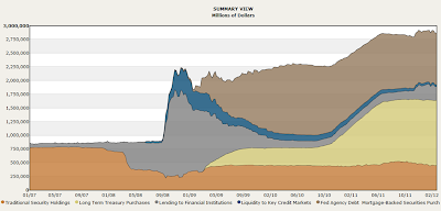
I have been talking a lot about the federal reserve balance sheet. But what is it composed of? And how did it evolve higher? Chart 1 gives the composition. You can see that QE1 and QE2 were mainly bond purchases (light brown area). QE3 should be another round of bond purchases and should expand the light brown area again. Second, the spike in 2008 was mainly lending to financial institutions at the time of the banking collapse. This lending has been paid off in 2010. But the most interesting part is the mortgage backed securities area in brown. In that period, congress passed the Emergency Economic Stabilization Act of 2008, which authorized the Treasury to purchase mortgage-backed securities. As a consequence, the brown area increased in size at the same time when lending to financials decreased. That means that the federal reserve has bought approximately $US 1 trillion of mortgage backed securities in an attempt to support the housing market. It didn't do much to the housing mar...

China May 2012 Gold Imports from Hong Kong Still in an Uptrend

Image
A little update on China's gold imports from Hong Kong. For May 2012, China imported 75.6 metric tons from Hong Kong . Pretty disappointing if you ask me, but the trend is still going up. The May 2012 imports are a sixfold increase from a year earlier, but down from April 2012's record. Chart 1: China Gold Imports from Hong Kong

ECB Rate Cut and its Effect on Euribor

Image
On Thursday 5 July 2012, the ECB cut its main refinancing rate to 0.75% and its deposit rates to 0%. After LTRO I and LTRO II, we have another stimulus to supply credit to the markets. In my previous article on LTRO I , I noted that the Euribor was manipulated lower to make it easy to lend (Chart 1).  Chart 1: 3 Month Euribor But it wasn't working out for the markets, because all the money was kept at the ECB deposit facility (Chart 2). Chart 2: ECB Deposit Facility Then, we got the interest rate cut of the ECB, and that lowered the Euribor another step from 0.64% to 0.55% as witnessed on Chart 1 (see the little spike downwards). So what does all this mean for you? Read the analysis here .

How Likely is QE3? 70% likely.

Image
Ben Bernanke has been saving his ammo in the past months. Each time the fed meeting was held, markets were hoping for QE3, but they didn't receive any. This is evidence by the U.S. federal reserve balance sheet on Chart 1. Chart 1: U.S. Federal Reserve Balance Sheet Today, we have passed several months and we already see that the economy is starting to deteriorate. Not only in Europe and the emerging markets, but especially in the United States. In this article I will focus on the key macroeconomic data in the U.S.

Angela Merkel With Hitler Moustache

Image
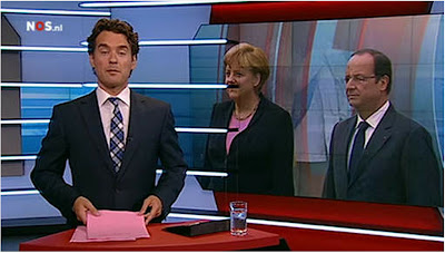
Today at 18:00 on the Dutch NOS News , we could see Angela Merkel with a Hitler Moustache. Of course unintended, but it begs the question: "why do people even notice"? Is Angela's mandate so similar to Hitler's? I disagree. We could argue that Angela is pro austerity, but her actions are all but pro austerity. The best example is the bailout of the PIIGS by Germany. Anyway, I just couldn't resist posting this nice souvenir to Angela Merkel. Angela Merkel's Hitler Moustache at NOS News

Denmark: Negative Interest Rates

Image
It's amazing that central banks actually started to send key interest rates below 0%. Denmark just put the key interest rate to -0.2%.  Of course, they have no choice as the Danish krone is pegged to the euro. Chart 1: EUR/DKK See Moneybags' video below:

Allana Potash: Update

Image
Agriculture has been in a bear market since February 2011 as evidenced by the Rogers Commodity Index for Agriculture (RJA). But surprisingly, since June 2012 something interesting happened. We got a spike of 16% in the agriculture price due to supply concerns in the corn, soybean and wheat market (Chart 1). This spike is also felt in stocks like Potash Corp. of Saskatchewan (POT) and Mosaic Company (MOS). As agriculture prices increase, so will the fertilizer prices increase. Chart 1: Rogers Commodity Index Agriculture (RJA) Agriculture is one of the sectors I'm very bullish on and it's not just me. Marc Faber's recent outlook for agriculture has been very positive . Marc Faber expects more weakness in industrial commodities, though he said agricultural commodities "look better". In the past year, fertilizer developers have been decimated. One of these developers: Western Potash ( ( WPSHF.PK ), had additional problems due to development doubts in their project d...

Copper Price VS. Contango Report

Image
I decided to start monitoring the contango-backwardation curve of copper (Chart 1). In a previous article I noted a pretty significant correlation between contango and price of copper. We see that the negative correlation between copper price and 1 yr futures contango is still existing. But it's difficult to predict the price of copper, because the contango curve and the price curve are almost exactly following each other. We could say we almost have a 100% correlation here. But, something weird happened on 14 May 2012 though, where the copper price was in steep backwardation, but the copper price didn't go up... So there still are discrepancies in this correlation. Let's see if this monitoring of the copper contango will bring new ideas. Chart 1: Copper Price-Contango (USD/lb)

Silver Net Short Positions Hit Record Low Again

Image
In my previous article about net short silver positions I said that silver would explode upwards once the net silver short positions started to increase. Today the June 2012 numbers came out and we see that the net short positions have not gone in an uptrend yet.  So we wait..., until the spring suddenly unwinds. Chart 1: LCNS Net Short Positions in Silver Data: http://www.cftc.gov/OCE/WEB/data.htm

Baltic Dry Index Reacting to Iran Oil Embargo

Image
Since Europe banned crude oil imports from Iran on 1 July 2012, the Baltic Dry Index has shot up 10% already from 1000 to 1103 (Chart 1). The reason for this spike isn't because Europe is banning crude oil imports from Iran, but rather the consequence of it. Due to this ban, Iran has renewed its threat to close the Strait of Hormuz . Approximately 20% of the world's oil, which is about 35% of seaborne traded oil, passes through this strait. As this strait is closed down, commodity transport vessels need to make a detour, which will increase the price of oil and increase the tanker rates. The availability of tankers will go down due to this forced rechartering of routes, which will decrease oil supply. As a consequence oil tankers will store oil in anticipation of rising oil prices and this will be beneficiary to the tanker industry. On 4 July 2012, the situation even got worse, with Iran threatening to strike 35 U.S. military bases within minutes . We will see that these events...

France's 7.2 billion euro tax is a non-event

France just raised taxes on the rich and is trying to get 7.2 billion euro in tax revenue in 2012 and 33 billion euro in 2013 . So what does this mean to the deficit of France? France's GDP is 2.56 trillion euro. France's debt is 90% of GDP. Its total debt is therefore 2.3 trillion euro. What is 7.2 billion on 2.3 trillion euro? It's 0.3%. So it basically does nothing to the French debt. You could argue that it is a first step to decrease the yearly deficit. But the deficit is currently 70 billion euro/annum. So we have a 10% decrease in the deficit, which is a non-event. It's like an obese person trying to lose weight by eating a smaller hamburger with less french fries. He is still gaining weight, but at a slower pace... For 2013 it is estimated that France will have a 50% decrease in deficit, but France will still have a deficit. And I believe France won't be able to wait till 2014 to decrease the deficit, because Europe would be in much worse shape than today.

U.S. debt jumps by $US 75 billion overnight

Image
U.S. debt jumped $US 75 billion overnight, which is a pretty big jump. Total U.S. public debt jumped from $US 15.781 trillion (28-Jul-2012) to $US 15.856 trillion (29-Jul-2012). The debt ceiling of $US 16.7 trillion is coming closer and closer. Historically, the biggest jumps were $US 154 billion overnight on 31-Dec-2010, $US 166 billion on 30-Dec-2009 and $US 166 billion on 29-Jun-2010. Average jump in debt is $US 3.5 billion. Chart 1: Total U.S. Public Debt

Euro Selling Has Stopped

Image
The new numbers of the Currency Composition of Official Foreign Exchange Reserves (COFER) have been released and it shows that the the world has stopped selling euros (Table 1). Claims in euros have increased from $US 1.413 trillion to $US 1.423 trillion, an increase of 0.7%. Claims in U.S. dollars have increased from $US 3.513 trillion to $US 3.548 trillion, an increase of 1%. Interestingly, the increase in U.S. dollar claims is flattening out as compared to previous quarters, indicating U.S. dollar weakness. In the previous three quarters, the claims in euros had been going down ($US 1.472 in Q2 2011 to $US 1.438 in Q3 2011 to $US 1.413 in Q4 2011). But that decline has stopped for now. I believe this reversal means that it's time to start buying into the euro again in the short term. Table 1: Currency Composition of FOREX Reserves To read the full analysis, go HERE .