Posts

Showing posts from October, 2012

Marc Faber confirming shift from West to East

Image
If you recalled my " the decoupling has started " article. I mentioned that Marc Faber tells us that money will go wherever it wants. Now Marc confirms himself that the Asian stock market could have a rebound as opposed to the U.S. stock market. The obvious reason be that the Asian stock market has underperformed the U.S. stock market by and large. He also doesn't anticipate a collapse in the stock market and real estate market because of money printing.

Jim Rogers is Shorting Bonds

Image
If Jim Rogers is shorting U.S. treasuries, you better watch out as he is mostly right.

GDP Numbers are Out for Q3 2012

Image
I'm always excited when I get another data point for my zero hour debt chart. Today the GDP numbers were out for Q3 2012. The media is all positive about the 2% growth in GDP year over year, but we all know 2% is not a positive number. Nowhere in that article they mention the debt growth, GDP growth is meaningless when debt grows faster than GDP. I wrote about zero hour debt here . We can see now, that our newest data point is right in line with our trendline. During the 3rd quarter, GDP rose 1% from $15.6 trillion to $15.78 trillion (quarter over quarter). But the debt rose 2% from $15.7 trillion to $16.1 trillion (quarter over quarter). That's double the GDP growth! Make your own conclusions... Chart 1: Zero Hour Debt

Quick Update: Gold/Silver Lease Rates

Image
I cautioned that the silver price could plunge due to silver lease rates going down in this post  on 19th August, 2012. I forecasted that when lease rates go down, the silver price would go down with it a few months later. That has come true, but now the lease rates are starting to go back up. So we could be close to a bottom formation. I'm getting my cash ready to buy silver again in a week or two. Chart 1: Silver Lease Rate The same is happening with gold lease rates. Chart 2: Gold Lease Rate

Another correlation: Obesity Vs. Debt

Image
"An obese person needs to diet just as a debt-based economy needs to cut spending." Chart 1: When you gain weight, you need to diet

Eric Sprott Investor Conference Manhattan

Image
It is very rare to see Eric Sprott in a conference, so cherish this opportunity. There is one thing I learned from this presentation and that is another thing I can monitor, namely, the silver and gold sales at the U.S. Mint here: http://www.usmint.gov/mint_programs/american_eagles/?action=sales&year=2012 According to the numbers, we had 48500 ounces of gold sold in October 2012. At the same time we had 2584000 ounces of silver sold in October 2012. If we look at the dollar value of these numbers, we get $82.5 million gold and $85.3 million silver bought in October 2012. So basically investors are buying the same amount of silver as gold, which is impossible according to Eric Sprott. It cannot last. Let's compare this to 1987. In October 1987, they sold 198000 ounces of gold ($93000000) and 800000 ounces of silver ($6400000). So you can see that they bought like 10 times more gold than silver. That has changed dramatically if we compare these numbers to today. I will make some ...

The Marginal Production Cost of Oil

There is a theorem about the marginal production cost of oil. The price of the commodity in question should always be slightly higher than the marginal production cost of oil. If not, then many companies that produce the commodity will start going bankrupt. Wikipedia has this definition for marginal cost of production: The change in total cost that comes from making or producing one additional item. The purpose of analyzing marginal cost is to determine at what point an organization can achieve economies of scale. The calculation is most often used among manufacturers as a means of isolating an optimum production level. In the case of oil, it would take over $100 now to produce an additional barrel of crude oil. The oil production cost was only $85/barrel in 2009 . So, if we see a crude oil price of $85/barrel today at a marginal cost of production around $100/barrel, a light should spark in every investor's mind. Especially when we hear news that Iran is threatening to stop expo...

Stock - Cash - Bond Decoupling Has Started

Image
As Marc Faber famously stated: "You can print money, but you can't control where the money will flow into." This is the most important line that investors need to keep in mind when we are talking about decoupling. Since Ben Bernanke announced QE3 on September 13, 2012, we all know money is going to be created out of thin air. We just don't know where the money will flow into eventually, we can only observe. As you may know, I started monitoring the correlation between stocks, bonds and cash since June 4th, 2012. Peter Schiff forecasted that once the decoupling started (meaning that stocks and cash drop at the same time), then the bond market would plunge. (Normally the U.S. dollar would strengthen when stock markets drop.) Since a month now, the decoupling has started to emerge (Chart 0). As you can see the green, red and blue dots are all trending down since a month. Chart 0: Decoupling between Stocks - Bonds - Cash To see what this decoupling actually means for you...

QE3 So Far: Nothing!

Image
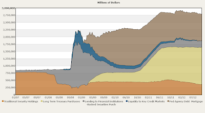
Let's give a status update on the QE3 $40 billion/month MBS buying and $45 billion/month U.S. treasury buying. If we take a look at the federal reserve balance sheet, we see that in October 2012, nothing at all has happened. The amount of treasuries is constant (light brown + orange area). The amount of MBS is also constant. The balance sheet is even shrinking instead of expanding! Chart 1: Federal Reserve Balance Sheet This can be confirmed here . Table 1: Federal Reserve Balance Sheet Detailed So where is the promised QE3, Mr. Bernanke?

Another 1 million ounces physical silver withdrawn from COMEX

Image
Another 1 million ounces of physical silver has been withdrawn from the same bullion vault Brink's. At this rate the vault will be emptied soon. The silver market is extremely tight right now, you can read it in this article: http://kingworldnews.com/kingworldnews/KWN_DailyWeb/Entries/2012/10/17_London_Trader_-_The_LBMA_Is_A_Massive_Ponzi_Scheme.html Chart 1: Silver COMEX Stock

Silver's Golden Cross

Image
It's getting boring to talk about silver the whole time but when it's appropriate, it's appropriate. Last week we had an important technical indicator for silver to go up. We had a significant "golden cross" which means the 60 day moving average crosses over the 200 day moving average. Historically that means we will have a rising silver price bull market coming very soon. Chart 1: Silver Chart

China U.S. Treasury Holdings August

Image
Numbers are out on the Chinese U.S. treasury holdings. In August 2012 China held $1.154 trillion in U.S. treasuries. Nothing much has changed other than that Japan almost has more U.S. treasuries than China. Chart 1: China U.S. Treasury Holdings As China holds its U.S. treasury holdings steady, the Chinese yuan has rallied somewhat against the U.S. dollar. I wonder what they will buy with these valuable yuan if they are not buying U.S. treasuries. Chart 2: USD/CNY

Default Looming in Physical Silver: David Morgan

Image
David Morgan, aka Silver Guru, talks about a real possibility of a default (or at least a slow delivery) for physical silver delivery above the amount of 30 million ounces. So swapping your paper silver or cash to physical silver on the market might end at one moment. Eric Sprott had already bought 10 to 20 million ounces of silver for a few times for the PSLV physical silver trust but David Morgan signals that you can't continue doing this for long as the silver supply is very tight.

Signs of Comex Silver Default

Image
Just a few days ago I saw a large drop in COMEX silver and now there is speculation on the internet about investors going for the real physical silver. They're done with the paper silver. Chart 1: Comex Silver Tom Cloud was interviewed by the 'Dollar Collapse' site and is analysing just this transition to physical silver. Tom Cloud of National Numismatic Associates has this to say: Dollar Collapse: Hi Tom. It’s been an interesting couple of days for silver, with a big Comex draw-down being followed by a sizable price drop. If the silver market wasn’t so obviously free and honest, it might be tempting to suspect some kind of manipulation… Tom Cloud: Late Friday afternoon a big client of JP Morgan requested delivery of 3.6 million ounces, which is 17% of all the registered inventory of silver (assuming it’s all really there). But only 1.6 million ounces were reported moved. A lot of people are asking where the rest of it is. If it wasn’t immediately available and the client...

Capacity Utilization Rate at 78.3% in September 2012

Image
For all those who are concerned that precious metals will go down for the rest of this year, there is some light  at the end of the tunnel. Capacity utilization rate for the total industry was up to 78.3% in September 2012 from 78% in August 2012. In particular, the mining industry recovered well, from 88.4% in August to 89.1% in September. While looking at these numbers, I don't see precious metals crashing just yet. Table 1: Capacity Utilization Rate Chart 1: Capacity Utilization Rate This statement can be confirmed if we look at the resource producing countries of Canada, Russia and Brazil. All of them are in a rising trend. Chart 2: Brazil Capacity Utilization Chart 3: Russia Capacity Utilization Chart 4: Canada Capacity Utilization The only country that isn't doing as well is Australia, where the capacity utilization rate declined over the entire year. Chart 5: Australia Capacity Utilization The probable reason for Australia's declining capacity utilization rate is a s...

Peter Schiff in Chicago 2012

Image
Highly recommended market outlook by Peter Schiff at Chicago Symphony Orchestra Hall 2012.

Large drop in Silver Stock COMEX: Brink's Vault

Image
Someone just took out 3.6 million troy ounces of silver from the Brink's vault at the COMEX. And it is registered silver, which means it's real physical silver. About $120 million at current prices. That's almost the same amount that Eric Sprott bought in his physical silver placement in July 2012. This is a very significant 1 day drop, you can make your own conclusions. See the balance sheet here:  http://www.silverseek.com/article/comex-silver-inventory-update-2526941838-ounces-6956 Chart 1: Silver Stock COMEX CME

Chinese Iron Ore Imports Make New High

Image
If you are concerned about the Chinese economy, you shouldn't. Chinese exports for the month of September came in at $186 billion , a 9.9% increase year over year. We did have a little dip end 2008 where exports fell to about $65 billion, but since 2009, the Chinese kept growing their exports as you can see on Chart 1. Chart 1: Chinese Exports As Zerohedge's chart points out, exports and imports are mostly equal. If exports move up, imports will move up too. Mostly exports are higher than imports as China has a trade surplus. The thing to consider is that if exports go up, imports will go up and as a result, commodities will go up in price (Chart 2). We had 3 months of consecutive drops in imports, but September has made an end to that. In September, China imported a record amount of iron ore , the highest since January 2011: 65 million tonnes. Also copper imports jumped to a 4 month high. Chart 2: Chinese Exports - Imports On Chart 3 you can see that 65 million tonnes of iron ...

Endeavour Silver: Prospects, El Cubo Strike, Silver Price

Image
One of my favourite companies, Endeavour Silver, gives an update. Bradford Cooke explains how silver will keep going up. He gives more info about the newly acquired El Cubo Mine and why the stock went down because of it and expands further on the recent one day strike at the mine.

Natural Gas Set to Rise 10%

Image
Here is a little thought experiment. Why are futures traders paying so much each month to roll over their natural gas contracts? The annualized cost is currently 178%, this is a high rate. Together with a contango curve from $3.4 per million British thermal units today to $3.6/mmbtu a month later and $3.7/mmbtu two months later. We can say that traders are already pricing in a rise of 10% in the coming two months. So you can be guaranteed that the natural gas price will rise. What do you do then? You buy cheap natural gas companies in the short term, for example Chesapeake Energy (CHK). Chart 1: Natural Gas Contango and Roll-over cost

China Gold Imports from Hong Kong Plunge

Image
According to the Chinese government gold imports in the month of August 2012 plunged to 53.5 metric tonnes  from 76 metric tonnes a month earlier. As you can see this is a significant drop. It can be partially attributed to the increased production of Chinese gold because China produced 41.4 metric tonnes in August, which is 12 metric tonnes more than the average of 30 metric tonnes of gold produced per month in China since 2012.  China produced 250 metric tonnes of gold since 2012. Chart 1: China Gold Imports from Hong Kong If we look at net gold imports from Hong Kong to China on balance, we have 29.3 metric tonnes of net imports, which is back at the lows of January 2012 (Chart 2). Far less than the net imports in April - July 2012. At least it is still in line with the 2012 numbers, but I had hoped China would buy more gold. Chart 2: China Net Gold Imports from Hong Kong

End of fiscal year 2012 Interest Payments

Image
Today marks the end of the fiscal year 2012 for the interest payments on U.S. debt of which I talked about here . It's surprising that the interest payments have dropped so much in 2012. Probably due to a change in the accounting method for the Department of Defense (DOD) market-based securities, we got a one-time $75 billion decrease in interest payments  in the month of July. Otherwise we would have $435 billion in interest payments. So, in reality they paid $435 billion, but the reported number is only $360 billion. Just to make it look better. Chart 1: Interest Payments Vs. Total Public Debt

More and More Discouraged Workers

Image
This following graph should be concerning. We have government statistics (grey and red chart) and we have the real SGS Shadowstats statistics (blue chart). The key statistic to look at is that of the discouraged worker. Let's go over the definitions first. A discouraged worker is a person of legal employment age who is not actively seeking employment or who does not find employment after long-term  unemployment . This is usually because an individual has given up looking or has had no success in finding a job, hence the term "discouraged". This discouraged worker includes two categories: short-term discouraged (less than 1 year) and long-term discouraged (more than 1 year). The government statistics only show the short-term discouraged workers (U6). Why do you ask? Political considerations, to improve the statistics and this is especially true after year 2009 as we will see below. Since 1994 Shadowstats has included long-term discouraged workers. Long-term discouraged wor...

Non-Farm Payroll number Vs. Unemployment Rate

Image
Non-Farm Payroll numbers came out at 113000 in September and the unemployment rate fell to 7.8%. Gold initially dropped as everyone thought that the decline in the unemployment rate was positive, but actually it is not. Peter Schiff mentions why in his update here . As I mentioned before here , the non-farm payroll numbers are more important than the unemployment numbers. Especially when government is underreporting on the unemployment numbers as discouraged workers and part-time workers aren't counted in the unemployment numbers. To get a higher employment in the U.S. industry we need to have at least 200000 for the non-farm payroll number, which we didn't get at all. We only got 113000, which is only half of the goal we need to achieve. So the reality is: the unemployment rate went up, even though the government statistics say differently. The reason being that the population is growing faster than people are getting jobs. Chart 1: Non-farm payroll

Marc Faber Vs. Jim Rogers

Image
Two of my favourite guru's against each other, that will be a fierce fight (and funny too). But it turned out to be not much of a fight as they agree with each other, except for stocks.

Silver/Gold LCNS update

Image
So far so good for the trend in LCNS for August 2012. As I mentioned before here  and here , the LCNS is a leading indicator for the silver price. Once you see the LCNS go up, the silver price will go up a few weeks after it. In an email update from Peter Schiff last week, he mentioned that silver would be the best commodity to buy these days. I agree, there is a very good chance that silver will blast through the resistance of $38/ounce. Don't wait for a pullback. Chart 1: LCNS Silver positions Chart 2: Silver Price As for gold we see the same happening (September 18th, 2012). LCNS is spiking upwards, so there is a good chance we will see gold higher the next few weeks. Once you see the LCNS go down, you start to see a pullback. I believe though, that the LCNS has already bottomed out and will continue higher. Chart 3: LCNS Gold positions Chart 4: Gold Price

Marc Faber Interview OneRadioNetwork

Image
It's been a long time since we had a long interview with Marc Faber.

U.S. debt just jumped $100 billion

Image
The total public debt stands at $16,171,037,343,408.57 right now, while it was $16,066,241,407,385.89 a few days ago. That's a major jump upwards... Everyone thought the debt would flatten out, but everyone was wrong. At this pace we will rapidly go through the debt ceiling of $16.3 trillion. This chart proves it: Chart 1: Total Public Debt You can anticipate a major announcement soon about the debt ceiling and maybe a downgrade of the U.S. treasury by Moody's ...

James Turk: Why you should own gold

Image
Interesting presentation from James Turk. What keeps me bullish is his Gold Money Index which still indicates that gold is way undervalued at this time. Another item mentioned in the video (an item I've talked about many times) is the deficit to outlay ratio. The U.S. is spending money which is borrowed for 40% on average from foreigners. The latest data on deficit to outlay ratio in August 2012 shows that we borrowed 52% from foreigners to spend on our U.S. programs (medicare, social security, defence, pensions, education...): Chart 1: Deficit to Outlay Ratio If we keep going this way, hyperinflation is a certainty.

Diamonds: The Less Known Commodity: Olivut Resources

Image
Everyone is talking about gold and silver these days, but nobody talks about diamonds. Let's have a little peek inside this sector. There are many sorts of diamonds in different colors and different grades. The higher the grade, the more precious the gem is. Aside from being pretty, diamonds can also be used in industrial applications (Figure 1). Figure 1: Diamonds in Industrial Applications We live in the year 2012, and what is very important about 2012 is that we are at an inflection point. The diamond market is to be found in the developed world as Asian/emerging markets only have a 10%-30% stake in this market (Figure 2). This means that demand is going to keep growing in countries like China and India, while we won't have any new and significant discoveries. In fact, we haven't had any Tier 1 discoveries in over 17 years now. Tier 1 discoveries are very large and very high grade discoveries by the way. Figure 2: Diamond Demand As a result, we will get a huge supply an...