Posts

Showing posts from February, 2013

Correlation: Margin Lending Vs. Stock Valuation

Image
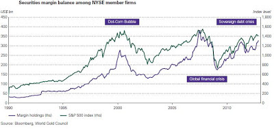
I came across an interesting correlation: Margin Lending Vs. S&P. Margin loans are programs that allow investors to borrow money to buy equities. So if you think through it: the higher the margin balance in the market, the higher the S&P will go, because people will have more borrowed money to put in the stock market. Today, the total margin balance is at $350 billion for NYSE member firms. The evidence is presented on Chart 1. You can see that there is no lag between the two charts, so it's a rather useless correlation to time the market. Chart 1: Margin Balance Vs. S&P Although fairly useless, sometimes there are discrepancies that can be spotted. For example, the rising Australian stock market could be overvalued at this moment when you look at their declining margin lending rate (Chart 2). So it can be interesting to watch this correlation. Chart 2: Margin Balance Vs. ASX200

Update: Beleggerscompetitie

On the Belgian Investors Competition, I'm still standing on last place with my dreaded declining gold and gold mining stocks. But let's take a look at the top 10. It looks like Diddenboyke has held his position rather nicely. 1) tompau: long stocks, France Telecom, Air Liquide 2) pmanager: ING, long stocks 3) Diddenboyke: short gold, Barco, Adidas, Total, GDF Suez 4) DRACHE: Barco, Heineken, long stocks 5) Maarten Janssens: short stocks, Bekaert 6) Freak of Nature: short gold 7) Yamayoze: Gold Fields, Umicore, long stocks, Commerzbank 8) Bouchez: Gold Fields, Harmony, short stocks, Arcelormittal 9) Rover45: short stocks 10) Lapitop: ING, sipef, short stocks As a summary we see that people aren't sure if we should be long or short stocks. What is sure is that you should be short gold apparently. France Telecom, which I recommended in the previous update here , is being held by "tompau" and could be a winner here. It is interesting to see that someone is holding Sip...

Update: Precious Metals Premiums

Image
Just wanted to give a status update on the premiums. The trend in premiums is still in an upward phase. A little side note, the bitcoin price has skyrocketed and continues to do so. Chart 1: Silver Premium First Majestic Silver Bullion Premium Chart 2: APMEX Silver Premium Chart 3: Shanghai to London Silver Premium Chart 4: Shanghai to London Gold Premium

The Leverage in COMEX Silver is about to Explode

Image
Why is the eligible silver going up at such high pace and open interest going up at the same time? As I told people before , eligible silver is not allocated. People think they own it, but it is not available for delivery. The ratio of registered to eligible is now: 29.7%. Down from 33% the last time I looked. As this ratio between registered and eligible goes down, the leverage is going up and up. And when this leverage breaks (due to a short squeeze), the non-eligible supply of smaller bars and coins is going to disappear in front of you. Chart 1: COMEX Silver People know this, and as a result are buying physical silver in record quantities. The U.S. Mint just sold a never seen record of 3.37 million ounces in February 2013 .

Correlation: The Dow Theory

Image
Peter Schiff's Radio Show has reminded me that there is a correlation in the Dow Transports Vs. Dow Industrials. He said in the 26 February 2013 radio show that when the Dow Transports doesn't go up together with the Dow Industrials, then it is likely that the Dow Industrials will go down. That's the Dow Theory. The definition of the Dow Theory goes like this: In Dow's time, the US was a growing industrial power. The US had population centers but factories were scattered throughout the country. Factories had to ship their goods to market, usually by rail. Dow's first stock averages were an index of industrial (manufacturing) companies and rail companies. To Dow, a bull market in industrials could not occur unless the railway average rallied as well, usually first. According to this logic, if manufacturers' profits are rising, it follows that they are producing more. If they produce more, then they have to ship more goods to consumers. Hence, if an investor is lo...

Correlation: EPS revisions Vs. S&P

Image
This is a fun correlation. By just looking at the EPS revisions (which is still negative), you can see that the stock market has outrun its pace and is due for a correction. Chart 1: EPS revisions Vs. S&P

Record High Insider Selling Marks The Top In The Stock Market

Image
There are several indicators today, marking a major top in the stock market. One of those indicators is the overvaluation in the stock market according to the " Warren Buffett Valuation " of the total U.S. stock market index as compared to U.S. GNP. We found out that stock markets are overvalued today, because the total U.S. stock market index is at 100% of  U.S. GNP. Normally we see that the total U.S. stock market index is at 80% of GNP. We just recently had news that U.S. GDP was negative and I wrote about it here . When GDP declines, it inherently means that the stock market must decline, taking into account the Warren Buffett Valuation theory. Investors are much too bullish on stocks at this moment and we can see that in the Dow-Gold ratio, which is hitting a ratio of 9 to 1 as we speak. I believe though, we shouldn't be so complacent about stocks. After all, the P/E ratio of the Dow Industrials stands at 15.3 right now, while in the 70's, the P/E ratio was on av...

100% Chance of a Major Low in Gold Miners

Image
I don't know if you have noticed this, but sentiment on the gold miners is at a record low on a 3 year period (because the free chart only goes for 3 years...) Each time when we see a bottom in sentiment, the gold miners are bottoming out. I believe the best place to go right now is in gold mining stocks and I'll put the money where my mouth is, especially when Goldman Sachs tells you to sell your gold. Some suggestions: ASM, EXK, NEM. Chart 1: Gold Miners Sentiment Index

John Mauldin Vs. Peter Schiff

Image
John Mauldin Vs. Peter Schiff = To Print or Not To Print

Update on Shanghai Precious Metals Premium

Image
Just a little update for those who think precious metals demand is going down. As you can see, Asians want to pay a premium for precious metals. The west is selling gold, the east is buying gold... Chart 1: Shanghai to London Gold Premium Chart 2: Shanghai to London Silver Premium

Beleggerscompetitie: Update

It's a pretty embarrassing accomplishment for anyone to be almost last place in a competition, namely 22698th . It's all attributed to the decline in precious metals. All of the top 10, except Nass, have lost their position, because they were long gold. Here is the new list of top 10: 1) Diddenboyke: Short Gold, Adidas, GDF Suez, Total, Umicore 2) BOSSIE BAS: Short Gold, Credit Agricole, KBC, Nyrstar 3) Fanskb: Short Gold, BNP Paribas, Nyrstar, AXA 4) Remi261: Short Gold, Long Banks 5) tbourrie: Long Gold, China, Russia, ArcelorMittal, Ageas 6) DINAMO7626: RHJ International 7) Chovidio: Short Gold, Long Emerging Markets, Nyrstar, Air Liquide 8) Insomnia: Short Gold, Credit Agricole, Umicore, KBC, BASF, ArcelorMittal 9) Nass: France Telecom, Lafarge, AXA 10) Camul: Short Europe, Shell, Solvay Looks like most of them are short gold and long banks. Very interesting stock among these is France Telecom. Marc Faber suggested that we should buy European Telecom Stocks. Maybe this is o...

Huge Divergence Between Bitcoin and Gold Price

Image
How can the bitcoin chart (Chart 1) keep going up, while the gold chart goes down (Chart 2)? Apparently it can, but not for long, that is my take. Chart 1: Bitcoin Chart Chart 2: Gold Price Premiums on Shanghai are hitting new highs so stress is building up: Chart 3: Silver Premium Shanghai/London And U.S. Mint silver sales are hitting a record for this part of February.

Total Gold Stock at COMEX hits new low

Image
As predicted here , the total gold stock plunged to the lowest stock level since I monitored the COMEX, namely: 10676012 troy ounces. This was of course obvious when J.P. Morgan swapped eligible gold into registered gold a few weeks ago. Total stock at J.P. Morgan vault hit a low of under 2 million troy ounces. (Probably Soros is selling his GLD and now taking delivery...) Chart 1: Gold COMEX On the silver front we still see a huge increase in stock (and therefore also increase in open interest) (Chart 2). Chart 2: Silver COMEX It's surprising to see this huge divergence between silver and gold. I don't know what it means...

Update: Copper Contango Experiment

Image
There is no stopping of the increase in contango in copper. So don't expect a correction in copper price soon. Probably the stock market can still go up for a little bit, due to this expansion of the balance sheet of the Federal Reserve. Chart 1: Copper Contango

Brent Vs. Crude Divergence

Image
If you hadn't noticed, Brent and WTI crude oil were pretty correlated historically, but since 2011 something weird happened. Brent crude oil started to move up, while WTI crude oil was flat (Chart 1). This is mainly caused by the increased oil supply in North Dakota due to the applied technique called "fracking". This increased oil supply drove down the WTI crude oil price, while Brent crude oil (tied to the Gulf Coast) has increased. Chart 1: Brent VS. Crude To read more, go here .

China Ups U.S. Bond Holdings

Image
Surprisingly, China bought even more U.S. bonds and is now again the champion, just before Japan. Almost every foreign country increased its U.S. bond holdings in December 2012. And now realize they are making a loss on that purchase as yields went up. Chart 1: China U.S. Treasury Holdings

Shanghai Silver Premium Rising

Image
There is a lot of hope that Asia, when it opened this week after the lunar holiday, would normalize the precious metals market . And indeed, my chart tells me the demand is there. Premiums on silver between Shanghai and London keep rising (Chart 1). So, stay tuned for tomorrow! Chart 1: Silver Premium Shanghai / London

Update: List of Discovered Correlations

Once in a while I need to post an update on all discovered correlations. Positive correlations mean that if one goes up, the other goes up too. Negative correlations mean that if one goes up, the other goes down. Positive correlations: 1)  Silver premium Vs. Silver Price  2)  Baltic Dry Vs. Industrial Commodities 3)  Baltic Dry Vs. Copper 4)  Copper Vs. S&P 5) Oil Vs. Dow Jones 6)  Agriculture Price Vs. Health of Economy 7)  Agriculture Vs. Fertilizer Price  8)  CRB Index Vs. Commodity prices (oil, agriculture, metals) 9)  MZM velocity Vs. Inflation 10)  MZM velocity Vs. 10 year U.S. treasury yield 11)  Case-Shiller Index Vs. Housing Market Index 12)  Capacity Utilization Vs. Inflation 13)  Rhodium Price Vs. Automotive Industry 14)  Housing Price Vs. Rise of Wages 15)  O-metrix Score Vs. Stock Value 16)  Outlay Spending Vs. Hyperinflation 17)  Gold Money Index Vs. Gold Price 18)  Stock Div...

Correlation: Total Stock Market Index Vs. GDP: How to Value Dow Jones

Image
Today I learned about the Warren Buffet valuation of the stock market by looking at the total stock market index and GNP numbers (which is almost equal to GDP numbers + $200 billion). The total stock market index can be found here  and stands at $15.879 trillion on 15 February 2013 (Chart 1). It measures the market cap of the U.S. companies. Don't confuse this chart with the Dow Jones chart. Chart 1: Dow Jones U.S. Total Stock Market Index Now you compare that to the U.S. GDP number, which can be found here  (Chart 2). Chart 2: U.S. GDP If you then divide Chart 1 by Chart 2, you get Chart 3. If the chart goes above 100%, then the stock market is overvalued. Chart 3: Market Value to GNP ratio Here is the table for valuation: Chart 4: Valuation Table For example, in December 2007, the GDP was $14.25 trillion, while the total market cap was $15 trillion. 15/14.25 = 105%. Meaning overvalued. For example, in December 2008, the GDP was $14.08 trillion, while the total market cap was...

Tightness Continues in the Precious Metals Market

There are several indicators of a tight gold market right now and I want to show you this in the following analysis . I will talk about the GOFO rate, premiums, supply and demand, CFTC report. Investors shouldn't worry about the gold price declining, this is a healthy consolidation phase we are entering in now. Of course, we hear about George Soros lightening up his gold positions, Jim Rogers starting to hedge the gold price and Dennis Gartman shorting gold, but I see that more as a contrarian indicator. In the long term, fundamentals will win the battle.

The Federal Reserve Debt Limit

Image
This is just too funny not to share.

Gold Supply and Demand

Image
As I predicted here , the gold supply is declining by 1.4% in 2012  due to lower recycling. On the other hand, the gold demand from central banks soared. It is odd that the gold price hasn't reacted on this yet. The downward action this week in gold has much to do with the 1 week holiday in China. Fundamentals for gold look very good to me, at least on the demand supply side. On a side note, APMEX silver premiums have gone to a new high of 16.5%. Very interesting. Chart 1: APMEX premium on silver

Beleggerscompetitie: Update

We are one week further in the investors competition and I already dropped to position 20000 with my emerging market stocks and turbo gold which is dropping. You can follow me at " katchum ", but following my positions seems not to be a good idea lately... A lot of the investors from the previous week have dropped out of the top 10 too with the exception of VanLooy, Fidelski and Houtten. 1) Nass: Credit Agricole, Harmony, Infineon 2) VanLooy: Ageas, Commerzbank, gold, ING 3) gdelabassee: banks, Harmony, Inbev, Siemens, gold 4) Houtten: long stocks, Belgacom, GDF Suez, PostNL 5) Drache: long stocks, Heineken, Kinepolis 6) Dr Evil: long stocks 7) Fidelski: Umicore, Gold fields, gold, Japan, BASF 8) KVK1: Banks, Umicore, China 9) driesbe: China, Russia, stocks, K+S, Deutsche telecom 10)  jpah: Societe general, gold, Michelin, Mobistar It looks like everyone is bullish on banks now, still holding gold and Umicore seems to have a special place because it has dropped a lot lately. ...

Gold cannot be suppressed for long

Have you seen the bitcoin chart recently? http://bitcoincharts.com/charts/mtgoxUSD#tgSzm1g10zm2g25zv Have you seen the lease rate chart recently? http://www.kitco.com/lease.chart.html Have you seen the commercial short chart recently? http://snalaska.com/cot/current/charts/GC.png Have you seen the China gold import chart recently? http://seekingalpha.com/instablog/839735-katchum/1522571-december-2012-china-gold-imports-from-hong-kong-hit-record-high Have you seen the M1 chart recently? http://research.stlouisfed.org/fred2/series/M1 => Gold will not be kept down for long.

Avino Silver and Gold Mines: The Perfect Growth Story

Image
Avino silver and gold mines (ASM) is one of those miners that has long existed in Mexico and has a proven track record of 27 years. It closed in 2001 due to low metal prices but reopened in 2010 and is continuing to grow production as we speak. One of the most important aspects to take into account is the presence of a long existing infrastructure, including a mill with a replacement value of $40 million. This mill is fully operational now at 250 tpd (San Gonzalo mine) and is being expanded to 1250 tpd next year (Avino mine). For more information, I encourage investors to read the corporate presentation here . ASM closely follows the silver price as you can see on chart 1, so you're buying a leveraged instrument to the silver price and I'm very bullish on silver in the coming months. Chart 1: Avino Silver and Gold Mines Vs. Silver Price In this article I will talk about the catalysts of ASM. I think Avino Silver and Gold Mines is a pure growth story. Production will go up 6 fol...

Belgium Restricts Gold Buying

There is a proposal in the parliament of the kingdom of Belgium to make buying gold with cash illegal above 5000 euro. All transactions above 5000 euro in gold should be made electronically (so the government can trace you). This is of course a first step to make gold illegal and to confiscate your physical gold holdings. It is an attack on our privacy and I don't approve it. The more debt and the more government in a certain country, the higher the chance of repression by that government. Of course there is an option out. I'll just buy my gold in the Netherlands...

Investors Competition Belgium

In Belgium we have the yearly investors competition called: " Beleggerscompetitie ". Of course I'm participating too as " katchum ". You can search me if you want and view my "virtual' holdings. My standing is currently at position 8752 of 19000 so I'm above average... I'm currently in emerging markets, China, Russia, gold, agriculture, oil and base metals. Not that I'm a good trader, but what's interesting about this competition is that you can view the holdings of everyone, including the top 10. And you can win a car (Ford). I will list the top 10 participants' holdings here: 1) Vanlooy: Gold, Short Europe, Short CAC 2) Rover45: Gold, RHJ International, Short Europe, Short CAC, Long Oil 3) ik short dus ik ford: Gold, Short Europe 4) nicolas 812: Gold, Arcelormittal, Gold Fields, Harmony, Short Europe 5) harpy: Short Europe, Long Oil 6) 902314nd: Gold, Bekaert, KPN Koninklijke, Short Europe 7) astevens: Gold, Short Europe 8) eulsonc...

December 2012 China Gold Imports Hit Record Level

Image
As predicted here , China bought gold like there was no tomorrow in December 2012 as gold prices fell to a record low. They bought 114.4 tonnes. I believe January will be a good month too. Chart 1: China Gold Imports from Hong Kong Net imports were 84.7 tonnes. That's 84.7/114.4 = 74%. That's a record high, even higher than the 68% in November 2012. This means China isn't even trying to export its gold to Hong Kong anymore. It's scooping up all the gold they produce! I say: "Follow the money!"

Eligible Silver Spiking Upwards

Image
Something must be wrong here. Why is eligible silver rising at such a high pace, while registered silver doesn't budge? This trend can't last... Is it because shorts can't get out? Chart 1: COMEX Silver Stock If we look at the premiums on APMEX, we get this. 12% and 16%, which are pretty high premiums lately. Chart 2: APMEX 100+ silver coin premium Chart 3: APMEX 1-19 silver coin premium

Contango Report Update

Image
As predicted two months ago , the copper price has made a huge move upwards to $3.75/lb (Chart 1). Investors are worrying though, as the U.S. dollar is now strengthening again while stock prices decline. But I assure you that as long as the contango in copper doesn't fall down, the copper price will keep increasing. I will bet my copper contango theory on it. So don't count out the rise in stock prices just yet. Chart 1: Copper Price As a matter of fact, the copper contango widened this week, again with a rising copper price. That means we are still awaiting the massive spike upwards in copper. Chart 2: Copper Contango Vs. Copper Price

How to Monitor the Gold and Silver Premium Between Shanghai and London

He who searches, will find what he's searching for (or something like that). In a previous post here , I noticed that the silver prices between Shanghai and London were decoupling, with premiums as high as 10%. I didn't know where to find this Shanghai Exchange silver price. But today I think I found the site that gives these gold and silver prices (for free). You can find it on Bloomberg:  http://www.bloomberg.com/quote/SHGFAUTD:IND http://www.bloomberg.com/quote/SHGFAGTD:IND And when Bloomberg restricts access to their site, you can find it here:  http://www.sge.sh/publish/sgeen/sge_price/sge_price_daily/9550.htm Gold for example: On February 1 the Shanghai gold price was: 334.63 RMB/g. Which is 39339 Euro/Kg at 8.506 EUR/CNY. The London price of gold on 1 February 2013 was 39297 Euro/Kg. So the premium was 0.1% (which is normal because there shouldn't be a premium). Silver for example: On 21 December 2012 the Shanghai silver price was: 6.277 RMB/g. Which is 760.8 Euro/Kg...

Sprott Physical Platinum and Palladium Trust Goes Negative

Image
A very rare sight, physical platinum and palladium now has a negative premium in the Sprott trust. So you can buy platinum and palladium at a discount! This could indicate to a future drop in platinum and palladium. I was very bullish on platinum before, but today the platinum to gold ratio has gone up tremendously from 0.85 to 1.03. I think it's time to take some profits. Chart 1: Sprott Physical Platinum and Palladium Trust Premium

Correlation: Gold Volatility Vs. Gold Price

Image
When I see the current volatility in the gold market, one day it's up 1% and the next day it drops 1%, then I'm wondering if it was like this historically too. So I took the historic gold price and looked at the percentage changes (Chart 1). If you think of it deeply, you could say that when the volatility increases, the gold price should increase too because higher absolute changes in gold price indicate that this volatility can only decline if you have a higher gold price. So let's look at the results. Chart 1 (which looks like a soundwave) tells me that we had high volatility in each recession (grey area). So in recessions, people buy gold and sell gold at a higher pace, probably due to fear. 1980 had the biggest volatility, followed by 1975 and 2008. Chart 1: Gold Percentage Change If we then look at the gold price, we see that 1980 has the biggest rise in gold price, followed by 1975 and 2008. Chart 2: Gold Price The same can be said about low volatility. The lowest vo...