Posts

Showing posts from March, 2013

Bank Deposits Update

Image
Latest data shows no deposit flight yet in February 2013. Greece did decline together with Portugal, Ireland and Cyprus. But Italy and Spain had deposit increases. We'll see what happens in March 2013... Chart 1: Deposits Eurozone

Correlation: Recession Vs. Yield Spread

Image
I came across an interesting article that gives an empirical correlation between the yield spread between the 10 year and 3 month treasuries/bill and the probability of a recession when that yield spread narrows. The key is to monitor that the 10 year yield is always higher than the 3 month yield. If the 10 year yield starts to go closer to the 3 month yield and even goes below it, then we have a high probability of a recession. That correlation can be witnessed on chart 1. Each time the blue line goes below zero, we have a recession. Chart 1: Recession Vs. Yield Spread The last recession was in 2008. A few years before, the yield spread went to zero. Today we're in pretty safe territory (Chart 2). The green line minus the black line is 2%. If we see the black line go up again or the green line go down, we are in trouble. That's why the Federal Reserve never will increase the fed funds rate. Otherwise the black line will spike upwards. No problems today. But it pays off to wat...

Belgium the next country to fall

Image
As I said before here  and  here , Belgium is the next domino to fall after Greece. If you don't believe me, believe Zerohedge . As you can see on chart 1, the countries on the left have the least equity/capital reserves as a percent of deposits. So to avert insolvency of Belgian banks, depositors need to be thrown into the fire eventually. But luckily, Greece will be first... Prepare yourself. Chart 1: % bad debt that can be impaired before deposit haircuts

Shanghai precious metals premiums fall to zero

Image
Bad news, gold premium in Shanghai has reached 0%. It is not the time to buy gold right now. The same has happened in silver. Silver premiums fell to 3% from 5%. Chart 1: Gold Shanghai Premium

Copper Contango Update

Image
I have the feeling that we are going to make a bottom in copper soon, the contango will at one point begin to reverse. We are at 1.4% contango to price ratio now, it will go up to about 2-5% before it will reverse. Even when we have a copper surplus and record copper stocks in China. Chart 1: Copper Contango Vs. Copper Price The CFTC data shows that copper will most likely go up because large commercials are long. Chart 2: CFTC Copper

Valcambi Chocolate Bar

Image
I have to admit, this is pretty cool!

Bank Reserve Requirements in the Eurozone

Image
Following the crisis in Cyprus of which I talked about here , there has been a question on how much stress the banks can have during a bank run, before their liquidity is at stake. A typical bank balance sheet looks like this (Figure 1). If the deposits get drained on the right side, the cash gets drained on the left side. The question is, how high is the limit of a drain on deposits? Figure 1: Balance Sheet Let's analyze the bank reserve requirements first.  Chart 1: Reserve Requirements Then we look at the capital and reserves of the banks. The capital and reserves are given in the last column (Table 1). Table 1: Bank Statistics Chart 2: Capital and Reserves to Deposit Ratio Go here to read more.

Belgium deposits are not safe

Image
I happen to live in Belgium and there are some people there arguing with me about gold. I keep telling them to buy gold but they insist not to buy it. What they don't take in account is that Belgium is the next in line of the PIIGS. Belgium has one of the largest  debts in the Eurozone and has the highest taxes. As a result I don't think that higher taxes will be an option. So the only other option is to take your deposits like in Cyprus. Belgium happens to have a lot of uninsured deposits ready for the taking (Chart 1). With this chart I will have another argument up my sleeve. Of course I already prepared myself by taking all my money out of the bank. Chart 1: Large deposits and uninsured deposits

Correlation: 30 Yr. Treasury Yield Vs. 30 Yr. Mortgage Rates

Image
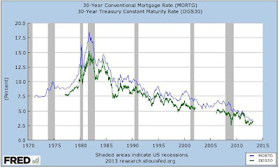
Just wanted to add another couple of correlations to my collection. We will learn about fixed and adjustable rate mortgages. These are correlated against treasury yields and fed funds rate respectively. 1) Conventional (Fixed) Mortgage Rate Vs. Treasury Yields As you can see mortgage rates are always higher than treasury yields because U.S. treasuries are considered much safer than mortgages. Chart 1: 30 Yr. Treasury Yield Vs. 30 Yr. Mortgage Rate 2) Adjustable Mortgage Rate Vs. Fed Funds Rate Adjustable Rate Mortgages on the other hand are linked to the Fed Funds Rate. Chart 2: 1 Yr. Adjustable Rate Mortgage Vs. Fed Funds Rate

Correlation: Disposable Income Vs. Housing Prices: Is there a housing bubble?

Peter talked a lot about housing on the radio show of 21 March 2013. He said that house prices could drop a lot from here, but I don't agree with that. To see where housing prices will go we need to look at 3 fundamentals. The most important one is wages and income. If your monthly disposable income doesn't match with the house you are buying, you will not be able to pay off your house. The second factor is mortgage rates. If you need to pay an ever increasing higher interest, you will have difficulties to pay off your house (at an adjustable rate mortgage). The last factor is savings. If you don't have a pool of savings, you can't make an adequate down payment for your house. Let's analyze these 3 fundamentals in this article .

COMEX Gold Data Update

Image
This is what incomplete COMEX gold stock data looks like after a laptop crash. Nevertheless you can see that total gold stock is declining very rapidly and the most important of all, it is a real trend changer. Look at how soft the curve was before and suddenly everyone takes their gold back starting from 2013. I think we are in for a rally. Especiallly in silver, where open interest is still very high. Chart 1: Comex Gold

List of All Discovered Correlations

Once in a while I need to post an update on all discovered correlations, we're getting a huge list already. If I only had some software to get automatic updates of these charts... Positive correlations mean that if one goes up, the other goes up too. Negative correlations mean that if one goes up, the other goes down. Positive correlations: 1)  Silver/Gold premium Vs. Silver/Gold Price   ( link 2 ) 2)  Baltic Dry Vs. Industrial Commodities 3)  Baltic Dry Vs. Copper 4)  Copper Vs. S&P 5) Oil Vs. Dow Jones 6)  Agriculture Price Vs. Health of Economy 7)  Agriculture/Food (leading indicator) Vs. Fertilizer Price ( link 2 ) 8)  CRB Index Vs. Commodity prices (oil, agriculture, metals) 9)  MZM velocity Vs. Inflation 10)  MZM velocity Vs. 10 year U.S. treasury yield 11)  Case-Shiller Index Vs. Housing Market Index 12)  Capacity Utilization Vs. Inflation 13)  Rhodium Price Vs. Automotive Industry 14)  Housing Price V...

Correlation: Deposits Vs. LTRO: How to monitor deposits of Eurozone banks

Image
Now that everyone is scared of the bank runs, it is necessary to monitor the deposits at the peripheral countries. The data is available at the ECB site : I compiled the data for the most important countries to watch, namely, the PIIGS. And of course Cyprus. Chart 1: Total Deposits of Peripheral Eurozone Countries If Cyprus falls, let's see what will happen to the PIIGS. Probably they will fall too. I will give a monthly update on this. I challenge you: do you see a correlation here between deposits and something else? Yes, it's the ECB's LTRO lending to banks (Chart 2). The country that gets the most LTRO will have the most deposits on their banks. That's because most of the deposits just stay on the balance sheets of the banks. Normally loans should go up, but that's not the case anymore since 2008. The deposit to loan ratio is going up (Chart 3). Chart 2: ECB Lending to Banks Chart 3: Deposit to Loan Ratio U.S. Banks If all people take their money out of the bank...

U.S. Deficit Spikes

Image
As December and January were pretty good months (no deficit), February 2013 marked a record deficit of $204 billion. The deficit to outlay ratio spiked to 60%, way over the hyperinflation ceiling of 40%. If the U.S. keeps going at this rate, we will see $2 trillion dollars in deficit soon. Chart 1: Deficit to Outlay Ratio

Bitcoin Exploding on Cyprus

Image
And if you hadn't noticed, bitcoin just exploded 20% to the upside on the Cyprus news, which bodes well for gold obviously. Chart 1: Bitcoin

What does Cyprus mean to your money?

On 15 March 2013 , Cyprus said it will impose a levy of 6.75% on deposits of less than 100,000 euros and 9.9% above that. The measure will raise 5.8 billion euros ($7.5 billion), which implies that we have about 68 billion euro ($85 billion) in deposits in the Cypriot banks. What this means is that each depositor in a Cypriot bank will get a haircut on their savings. This event is actually a very important one in history as it marks the first time that depositors actually lose their money, despite the presence of a deposit insurance. Of course, you can't have deposit insurance without a bailout of the banking system by the IMF. But to have this bailout, depositors need to have a cut (imposed by the IMF). It's sort of a paradox: "from now on deposit insurance is not insured anymore". Many people think that their deposits are safe when they put their cash in the bank, but they either lose it to inflation or in this case lose it to the government. The result is that inve...

Recovery of Shanghai Silver Price Premium Correlation

Image
This data was lost, but as you can see here, by just adding a few data points, it can still give us a good idea of the trend. Chart 1: Shanghai Silver Premium Vs. Spot Silver Price

Copper Contango Experiment

Image
One of the data that can't be wiped out from my computer is the Copper Contango Experiment. We see that the contango is widening each day, while copper price is declining. That is a normal thing. Once the contango reverses, we will see a spike in copper. I don't know when it will reverse though. Historically we need to go as high as 2-10% contango to mark a bottom in copper price as I pointed out here . Today we are at 0.04/3.5 = 1.1%. So there is still a ways to go. Chart 1: Copper Contango