Posts

Showing posts from May, 2013

Gold Has Now Hit Marginal Cost of Production

Image
In this post I will try to explain how important it is to watch the total marginal cash cost of gold mining to predict where the gold price ( GLD ) will be headed to. This marginal cost can be divided in two parts: cash cost of production and other costs (exploration, construction, maintenance, etc...) and stands at around $1300/ounce. With the recent decline in the price of gold, I believe we have finally hit the bottom. The gold price has always followed the marginal cost of suppliers throughout history ( Figure 1 ). The correlation between gold prices and gold mining cash costs between 1980 and 2010 stood at 0.85, which is pretty highly correlated (Source: CPM Gold Yearbook 2011). With the price of gold at $1400/ounce today I'm pretty sure we can't go much lower if this correlation proves to be correct. The following chart is the most important chart every gold investor needs to be aware of. As I mentioned before, there is a high correlation between the all in cash costs of ...
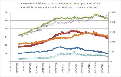
Bank Deposits Update: Spain is in trouble

Image
Time for another bank deposit update for the month of April 2013. Cyprus continued to have a bank run in deposits, but the most interesting event is that Spain's deposits are starting to deteriorate too. Guess where the deposits are going to? Yes, Germany, France, Italy and even Belgium. That means that money is flowing from the periphery into the center of Europe. I wonder how long this imbalance can continue. Chart 1: Bank Deposits Periphery of Eurozone

Shanghai Gold Premium Skyrockets to New Highs

Image
One of the most important features of this blog is that you get real time alerts on important data. One of those data is the premium I see on the Shanghai precious metals market. And today we see a huge increase in premium in gold (Chart 2). Gold premiums to London bullion price have reached 2.6%, the highest since I monitored it. Silver premiums also shot up to 3.8% (Chart 1). That's a bullish sign. James Turk  talked about these huge premiums in Asia: The huge premiums over spot in Asia and the long delivery times in London clearly show that this takedown in gold over the past few weeks was all about what was taking place in the paper market. Chart 1: Silver Premium Shanghai to London Chart 2: Gold Premium Shanghai to London

Correlation: Gold/Silver Ratio Vs. S&P

Image
Zero Hedge thaught us another correlation. The Gold/Silver Ratio actually has a meaning. When the ratio goes up, gold goes up more than silver, which means fear is growing. In that environment, the stock market declines. Conversely, when the gold/silver ratio declines, silver is stronger than gold, which means fear is going away and the risk-on trade is prevalent. Another way to look at it is: when stock markets plunge, silver won't do well. Chart 1: Gold/Silver Ratio Vs. S&P So we have yet another tool to predict the stock markets. Just keep it in mind. You can monitor the Gold/Silver ratio here: http://stockcharts.com/freecharts/gallery.html?s=%24GOLD%3A%24SILVER

Disconnect between selling price of physical silver and paper silver

Image
As the paper silver keeps falling (blue chart), some miners aren't willing to reduce their selling price (red chart) on their silver bullion. This lead to a huge disconnect between paper and physical silver of $5.5/ounce, or a 25% premium! Chart 1: Disconnect between Physical Silver and Paper Silver at First Majestic Silver Corp

Peter Schiff at MoneyShow Las Vegas 2013

Image
Peter can become a stand-up comedian anytime. Hilarious!

Correlation: Monitoring the GLD Trust ETF to Predict Gold Prices Based on Demand

Image
As demand is now being dictated for a part by the ETF's, we need to pay attention to what is happening in the trusts. Are they unloading their gold? Because if they keep unloading their gold, the demand from ETF's is going to decline, which has a negative impact on the gold price. This is the theory of supply and demand. You can monitor this chart daily at the SPDR gold trust site: http://www.spdrgoldshares.com/usa/historical-data/ Chart 1: GLD Trust: Units in the trust (tonnes) As I indicated here , ETF's were the largest sellers in gold, resulting in a 13% decline in the demand for gold. I cannot stress how important it is that ETF's keep buying gold. If they don't buy, like what happened starting in 2013, then the price of gold will decline. The great difference between 2013 and 2008 is that in 2008, ETF's were massive buyers of gold, while today they are massive sellers. Keep watching this trend. If it reverses, you can confidently start buying precious meta...

The Great Disconnect in the Paper and Physical Precious Metals Market

Image
Over the last few months, precious metals investors have seen their net worth decline due to declining precious metals prices ( GLD ), ( SLV ). A lot of this decline in precious metals prices was due to a decrease in demand, which was the result of selling by hedge funds as the World Gold Council reported here . First quarter gold demand of 963 tonnes was down 13% compared with Q1 2012 due to an outflow in the total gold ETF holdings of 177 tonnes. 2013 marks the first year in a decade where ETF's are actually selling gold. While ETF holdings were reduced, this selling has been countered by an increase in physical demand for gold by China and India. Total demand in China rose 20% to 294 tonnes in Q1 2013 as compared to Q1 2012 (50 tonnes increase). This huge increase in demand for physical gold can be witnessed on Chart 1, which gives the net imports of gold from Hong Kong to China. Chart 1: Net Gold Imports from Hong Kong to China While Chinese demand for gold was strong, Indian d...

Gold Lease Rate

Image
This page is created to monitor the "Gold Lease Rate". The gold interest rate earned on fiat gold is commonly referred as the gold “lease” rate. It is calculated as: Gold Lease Rate = Libor Rate - Gold Forward Rate. The LBMA presents the data every day at  this link . Whenever the gold lease rate tops out (spikes upwards), the gold price will hit a bottom as central banks demand the gold back from the bullion banks at higher gold lease rates. So it is a bullish sign to have high gold lease rates. It means that the GOFO rate is very low, which indicates backwardation in gold.

Gold Price Target

Image
This page is created to monitor the target price of gold as opposed to the money supply M1, central bank forex reserves, fed custodials and U.S. external debt. M1 correlates to gold because the more money is present in the system, the more gold can be bought and the higher the gold price will become. Central bank forex reserves correlate to gold because a central bank tends to have as much gold as forex reserves on their balance sheet. Federal Reserve Custodial accounts are a group of accounts that contain money from foreign central banks (mostly treasuries and a some MBS's). In other words these are the U.S. debt holdings of Foreign Central Banks around the world. It is a direct measure in our opinion of how foreign central banks view the stability and value of the dollar, and the current monetary policies of the US. It frequently shows changes in major financial trends far ahead of "the crowd's" awareness. A rising custodial trend is accompanied by rising gold price...

Red Alert in Gold Lease Rates

Image
I have become very bullish lately on silver and was already bullish on gold. But the following chart makes me ultimately bullish. We see the biggest increase in gold lease rates as of yesterday and we have seen this before. In 2008, the gold lease rates started to spike upwards, which meant gold was in short supply. It also meant that the "interest" to hold gold was going up, just like the "interest" on your cash is going up. This ultimately means that the world is valuing gold at a higher interest rate and the central banks are demanding their gold back from the bullion banks. We are in for a huge upside move if you ask me.

Percentage of U.S. Government Public Debt held by Foreigners

This page is created to monitor the Percentage of U.S. Government Public Debt held by Foreigners. The debt held by foreigners can be found here . From the chart we can conclude that an ever increasing amount of the U.S. Government Public Debt is financed by foreigners. As long as the chart keeps increasing, U.S. bonds are in demand by foreigners. Once this chart starts to decline, it means that confidence of foreigners in U.S. debt is starting to wane. The following chart gets updated weekly, so this is the most important chart to monitor.

Central Bank Balance Sheets: U.S., Eurozone, Japan

Image
This page is created to monitor the balance sheet of the U.S., Eurozone, Japan and the United Kingdom. There is a strong correlation between the price of gold and the expansion of the total sum of all central bank balance sheets in the world. ECB = blue U.S. Federal Reserve = red Bank of Japan = green Bank of England = orange (The Chinese balance sheet is not included in this graph as it is not available on FRED) source: tradingeconomics.com The U.S. balance sheet consists of Treasuries and Mortgage backed securities. The Treasury General Account provides cash for Bank Reserve Balances (which are a cost if they go up too much). Because the TGA is a liability—a source of funding for the Fed—when it falls, reserve balances must go up by a corresponding amount.   The Federal Reserve Balance Sheet is connected to the following entities. If you want to follow up on the Repo Madness. This FRED link will give you the amount of Repo's they buy. Usually, the amount of repos bought ...