Posts

Showing posts from December, 2018

Trump Became President, Stock Market Falls Off The Cliff

Image

Gold Forecaster Index: Gold Is Likely to Go Down

Image

Copper/Zinc/Lead/Nickel Production Vs. Silver Price

Image
Silver is mostly produced as a byproduct from copper, lead and zinc. If production of these metals goes up, then the silver price is likely to fall. The following two charts show this negative correlation.

Charlie Lee CEO of Litecoin makes great call

Image

Yield Curve Vs. VIX

The 10 year - 2 year bond spread is a leading indicator for the VIX with a 2 year delay. For more info, go here . (and the VIX is also called the fear index and is correlated to gold)

Credit Spreads Are Widening

Image
In case you are wondering why the 10 year yield has dropped below 3%. Here is the answer. The economy is slowing down and you can see this in the people fleeing corporate bonds and going into treasuries. Credit spreads are widening and it's a bad thing.

Open Interest Vs. Gold Price

Image
Open interest correlates with the gold price.  

3-2 Treasury Yield Vs. 2-1 Treasury Yield

The 3 year - 2 year treasury yield is a leading indicator for the 2 year - 1 year treasury yield and provides a good indication on how the yield curve will evolve. The delay is 4 months. For more info, go here .

Boss Fight

Image

Yield Curve Vs. Net Interest Margin

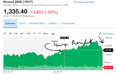
The yield curve shows the difference between the interest rate of high maturity bonds (10 year treasury) and low maturity bonds (e.g. 3 month bond). When this yield curve spread is high, the banks have high income streams from their loans at high yields, while their costs, paid as deposit interest to depositors, are low. That results in a higher net interest margin.