Posts

Showing posts from January, 2013

J.P. Morgan Converts Almost Half of Eligible Gold to Registered Gold

Image
I couldn't believe my eyes when I saw this. Suddenly we saw the J.P. Morgan vault get almost half of the eligible gold converted into registered gold. I have seen this before... I think someone wants delivery. Let me do some research on this... Edit: Yes indeed, we saw J.P. Morgan do the same with silver a year ago here  in November 2011 (right before a huge rise in silver price). The consensus was that they are preparing for a large delivery to someone. They increased registered stock to prevent a COMEX default. This is also a sign of loss of confidence in paper gold and silver. Let's see what happens next, probably a decline in total stock. Chart 1: Gold Stock COMEX

Public Sector Credit Expansion Vs. Private Sector Credit Contraction

Image
In 2009, Marc Faber said these words at one of his famous seminars:  "But for the fiscal stimulus to even have a small chance of succeeding at reviving economic activity it has to be larger than the private sector credit contraction." In today's world we have 2 opposing forces, one is Ben Bernanke's public sector credit expansion (Chart 1) and the other is private sector credit contraction (Chart 2). If credit grows, all is well, but when they cancel each other out and credit contracts, a recession will start. To make it easy I took the credit growth chart for the money creation of banks (Chart 1). For the private sector I took the household debt chart (Chart 2). Bank credit is going up due to money printing: Chart 1: Bank Credit Private sector debt is declining due to repayment of debt. I indicated that the savings rate has gone up to 6% now, so I expect more repayments in the future. Chart 2: Private Sector Credit If we then add these two charts together we get Ch...

Chinese Silver Imports

Image
I finally found some data on Chinese silver imports through the Silver Investment Conference here . You will have to register for free there. Some interesting keynote speakers I like are Eric Sprott, David Morgan, James Turk. You can watch them today live. Apparently the Chinese have been net buyers of silver, just as they have been becoming net buyers of gold (Chart 1). Chart 1: Chinese Silver Imports through Hong Kong

Savings Rate Points to a Deja Vu Recession

Image
Remember where I said this : "Unlike in 2008, the savings rate isn't going up though (Chart 5). If this trend actually reverses upwards, the real collapse will start because when people save money, debt will be paid off and the currency supply will drop." It has finally happened, the savings rate is going up to 6% (Chart 1). Credit is being repaid, the currency supply is going to shrink and the economy is on the verge of collapse, again. The GDP has gone negative, if we get another negative growth in GDP, then we have a recession. Chart 1: Personal Savings Rate

Registered Silver Not Increasing With Open Interest

Image
For people who are worried about the recent rise in the total silver stock at the COMEX I want to point out that the registered inventory hasn't gone up (Chart 1). Only the eligible inventory has gone up. The ratio of registered to eligible is now 33%. In 2009 it was 133% (more registered than eligible silver) (Chart 2). Chart 1: Silver Stock COMEX The lowest ratio historically was 40% mid 2011 if we look on Chart 2. But today the ratio is even lower as I stated before (namely 33%). Eligible silver is now at the highest ever while registered silver is at the lowest ever. The reason for this is that people are taking delivery on their physical silver. That's the fact. Only registered silver counts, eligible silver is just a warrant that can be converted into registered silver. But you need to find this registered silver somewhere of course... Chart 2: COMEX silver stock The funny thing is that open interest is increasing now. As of the previous week open interest had increased t...

Doug Casey Interviews Peter Schiff

Image
Peter Schiff talks about gold.

ADP Report Vs. Unemployment Rate

Image
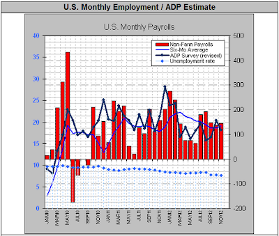
Today we also found the ADP jobs numbers for the month of January 2013 and it came out to 192000 jobs. This is pretty good, but if you look at the trendline on Chart 1 we are still going down. Job growth isn't keeping up with the rise in population, we need to have at least a payroll number above 200000 to reduce the unemployment rate. The declining unemployment rate (blue dots) is not to be trusted because if it were real, the red bars would be going up, not down. Chart 1: ADP numbers Vs. Unemployment

PMI Suggesting Further Euro Strength

Image
GDP growth in the U.S. was 0% the last quarter and that is consistent with the PMI going below 50 in the U.S. While the U.S. economy is deteriorating, the PMI in the eurozone is in a rising trend again and soon will catch up to the PMI of the U.S. Maybe we can even get a positive GDP growth in the eurozone at some point. This trend is positive for the euro going forward. But we need to be aware that the ECB has some bullets left to devalue the euro soon... Chart 1: PMI Eurozone Vs. PMI U.S.

Zero Hour Debt Has Arrived

Image
As I have warned investors a few months ago on the "Zero Hour Debt" problem  here on July 2012 , today we find out that GDP has actually reached the 0% growth rate while the debt growth is increasing at an enormous pace. Real GDP in the U.S. has decreased 0.1% in the fourth quarter of 2012 to a mere $15.8 trillion while debt has grown 2.4% to $16.4 trillion. As you can see on Chart 1, the ratio between nominal GDP Growth and Total National Debt Growth has touched the zero line, which means that additional debt growth is not stimulating the economy anymore. We really are reaching the end game here and will see a parabolic increase in debt. Chart 1: Nominal GDP Growth to Total National Debt Growth Ratio To read the analysis, go here .

James Turk: 100% Chance of Hyperinflation in the U.S.

Image
James Turk is 100% sure of Hyperinflation in the U.S. A very bold prediction.

Copper Contango Update: Setting up for Take-Off

Image
Dears, I'm getting increasingly excited with the prospects in the copper market. The contango has yet steepened again, while the copper price is still in an uptrend (Chart 1 and Chart 2). Once the copper contango goes back into backwardation (red dots go down), the copper price will surge. The copper price trend is in an ascending phase (Chart 2) and that tells me that stocks will rise (along with gold). Bonds will suffer greatly as the USD will plunge. You can bookmark this post and remind me in a month from now. Chart 1: Copper Contango Chart 2: Copper Price

Correlation: Bitcoin Vs. Gold

Image
I just recently heard about this alternative currency: Bitcoin. Apparently this is a digital currency that is standing on its own and has a total market value of $150 million. It came into existence in 2009 with the creator Satoshi Nakamoto. I don't advocate using this digital currency as it is nothing you can really hold in your hands. But it's interesting to analyze it.  If bitcoin is really a currency that is existing out of the "system", then it should follow the price of gold closely. And looking at charts 1 and 2, you can clearly see that the tops in July 2011, January 2012 and September 2012 are found in both charts.  Chart 1: Value of Bitcoin Chart 2: Gold Price The weird part though is what is happening from October 2012 onwards. As the value of bitcoin soared to $20, the gold price didn't keep up with the trend. So we now have a disparity between the two charts and it points to an either lower bitcoin price or a higher gold price. If we extrapolate the t...

Swiss Gold Repatriation Almost Reality

Image
A year ago, 4 Swiss parliament members launched the "Swiss Gold Initiative" to repatriate their gold to Switzerland. Today, almost one year later we have 90000 supporters for this initiative. Once the 100000 supporters is reached, we are certain that the Swiss National Bank will repatriate their gold holdings. I'm sure those 10000 votes will be reached by March 2013. So not only the Germans want their 3400 tonnes of gold back, now the Swiss want their gold back. As of September 2012, the SNB had 55591 million CHF gold (Table 1). That's 59139 million USD gold or 33.4 million ounces of gold or 1040 tonnes of gold. That's one third of Germany's gold and is pretty significant. The SNB hasn't said where its gold is and also hasn't said if it will repatriate their gold all at once, but if they were to repatriate it all at once, it would be almost double the amount that Germany is now repatriating over 7 years: namely 674 tonnes of gold. Table 1: Swiss Natio...

Peter Schiff at Cambridge House International's Vancouver Resource and Investment Conference in January 2013

Image
Peter Schiff at the Cambridge House Conference:

Correlation: Food Stamp Participation Rate: The Real Way to Measure Unemployment

Image
I want to make sure that people comprehend the manipulation in the unemployment numbers. If we look at the unemployment rate in the U.S., it seems that everything is improving. U3 unemployment has dropped from 10% to 8% in the last two years. U6 unemployment came from 17% to 14% in 2 years. But all is not well if we look at another metric which is the percentage of people on food stamps. I think this metric is giving a much better view on the state of the U.S. jobs market (Chart 1). Chart 1 tells us that the declining U6 unemployment rate is BS as a record number of people are still making use of food stamps. Chart 1: Percent of Population on Food Stamps If we compare the unemployment rate (Chart 2) against the percentage of the population on food stamps (Chart 3), we can see that there is a correlation here. In 1970 for example, the U3 unemployment rate was 5% with a food stamp percentage of 2%. Then we peaked in 1982 with a U3 unemployment rate of 10% and a food stamp percentage of 1...

Pentagon Slashes 6% of Workforce

As a follow-up on this post , where I pointed out that the debt ceiling is taking its toll on the workers at the Pentagon, today we were notified that of the 800000 employees at the Pentagon, 46000 will be terminated as of today . Although this is but a small percentage (6%), it still points out that the budget of the U.S. is in trouble. If the March deadline on $50 billion budget cut isn't resolved, Pentagon employees will have to work 1 day less each week from that day onwards. The moral of the story is that money is critical for the defense sector of a country. No money means no security.

Royal Canadian Mint Short in Silver Supply

Short update: As I told everyone silver is in supply shortage here , we found out today that the Royal Canadian Mint is in short supply of silver too. So it is a widespread phenomenon. Here is the article from Goldstockbull.com written by Jason Hamlin on the 23th of January 2013: Last week the U.S. Mint announced that it had run out of its initial production of 2013 Silver Eagles and that new shipments would not be available until late January. At that point, sales are expected to be resumed under an allocation process. The Mint has used an allocation process to ration available supplies amongst their primary distributors in the past, as opposed to allowing the distributors to buy as many as they want or need. On the first day of availability for 2013-dated Silver Eagles, authorized purchasers had placed orders for 3,937,000 of the one ounce coins. This seemed to mark the highest one-day sales in the entire history of the program. The strong demand has continued with sales now having...

Federal Reserve Surpasses 3 Trillion Dollar Balance Sheet

Image
As of this week, the Federal Reserve has officially gone over $3 trillion in its balance sheet . It is buying MBS and bonds as promised. Of course this has consequences as I pointed out here . The euro made a 1 year high against the U.S. dollar. U.S. bond yields are breaking resistance at 1.92% yield on the 10 year treasuries. What's very odd is that the gold price keeps languishing. A weak dollar environment should be very bullish for gold. Chart 1: Federal Reserve Balance Sheet Table 1: Federal Reserve Balance Sheet (detailed)

Silver premium monitoring

Image
I have been monitoring the Engelhard bullion price to spot silver, but I don't see any significant movement here. So I'm going to stop monitoring this. Chart 1: Silver Premium Engelhard bullion to spot silver On the other hand, I'll now monitor a real dealer of silver, namely: First Majestic Silver Corp. Figure 1: First Majestic Silver Bullion Price Their selling price is displayed every day here . Today it stands at: $33.25/ounce. The spot price of silver is $31.22/ounce. That's a 6.5% premium. I think this tells me more about the silver premium than the Engelhard bullion price.

Interconnectivity of Banks

Image
I just love this figure that gives the interconnectivity of banks. If J.P. Morgan (JPM) and Bank of America (BAC) fail, the entire system fails. That means that they will never fail, as the Federal Reserve will always protect them. Figure 1: Interconnectivity of Banks

Copper Contango Update

Image
The contango on copper has been topping out as the LME stock level has also topped out. As copper goes back to backwardation, I see the copper price go up from here. It already spiked back to $3.68/lb which is the highest since October last year. And stocks are following nicely with this uptrend. Chart 1: Copper Contango Vs. Price

Correlation: Real Interest Rates Vs. Gold Price

Image
I came across a Zerohedge chart and tried to duplicate the chart. The chart is about how gold goes up when real interest rates (adjusted for inflation CPIAUCSL ) on 10 Year Treasuries  approach zero. And as you can see, the red line (10 year treasuries adjusted for inflation) is now exactly at zero. So that is bullish for gold. The red chart right = Yields on 10 year treasuries adjusted for CPI. The green chart left = Percentage change in Gold. Chart 1: Gold (% change) Vs. Real 10 Year Interest Rates (% change) Very interesting correlation and tool to monitor.

Signs of Silver Shortages

There are several signs of silver shortages brewing. Investors who have interest in paper silver like SLV or AGQ need to be aware of this as their holdings could blow up in a very short time frame if they don't notice the current shortages in the physical silver market. First, the most important indicator for the physical market is the silver sales at the U.S. Mint. Second, on that first day of silver sales at the U.S. Mint, the trading volume on the Shanghai Gold Exchange’s 99.99 gold physical contract shot through the roof, hitting a record of 19,504.8 kilograms, after double-counting transactions in both directions. Third, we see that the premiums on Silver American Eagles for APMEX (American Precious Metals Exchange) are soaring to $4 for a single ounce of silver. Fourth, we can see these premiums for Silver American Eagles even go up on eBay, with prices going from  $38/ounce to even $60/ounce, while the spot price is only $32/ounce (18 January 2013). Fifth...

No U.S. Deficit in December 2012

Image
The U.S. has done a good job in the month of December 2012. Its outlays of $270 billion were fully absorbed by receipts of $270 billion which makes the December 2012 deficit zero (Chart 1). I think most of this is due to the fact that the debt ceiling was reached in December, so the U.S. couldn't spend as much money as it could. Chart 1: Deficit to Outlay Ratio U.S.

Nice Site to get Current COT Reports

Image
I always thought by myself, how come the COT site doesn't give current charts and current tables here . I mean, those numbers are 2 months old... Because of that, I didn't have current information. But we have a breakthrough here. Thanks to Dieuwer from Seekingalpha, who pointed out I make a lot of mistakes, I now have a very interesting site to share. Namely:  http://www.cotpricecharts.com/commitmentscurrent/ On that site, the two most important ones for me are the one for silver/gold and the other for 10 year bonds. Gold:  http://snalaska.com/cot/current/charts/GC.png Silver:  http://snalaska.com/cot/current/charts/SI.png 10 year bonds:  http://snalaska.com/cot/current/charts/TY.png Let's talk about the silver one first. Chart 1 gives us immediately the commercial interest. And we see that today the commercials are pretty short silver. That means that silver will be weak at this time. Once the commercials start to become long again (purple chart goes up), like in ...

U.S. Bond Market About to Implode

Image
I just wanted to give an update on the status of the U.S. treasury market. I warned about a bond bubble here , stating that short interest in the commercials was going up dramatically. The last months we have seen weakness in the bond market as a result, but if you think it's already over, I have to disappoint you. The bond bubble collapse hasn't even started yet. On Chart 1 we can see that since that article, the net short positions for the commercials has even gone up (pointing to a weak bond market and a bottoming out of yields), and the non-commercials have kept buying more and more bonds, thinking it would be a good investment. If these non-commercials unwind their long positions, we will start to see the real bond bubble collapse. Chart 1: Commercial Open Interest in Treasury Notes Even though non-commercials are buying like crazy, the yields haven't gone down. On Chart 2 we see that yields have risen even when long positions in non-commercials went up. This is not a ...

China keeps buying U.S. Treasuries

Image
I had expected that China wouldn't buy as much U.S. treasuries in November 2012 because they bought a lot of gold (62 tonnes or $3.2 billion). But they did increase their U.S. treasuries by $200 million to $1.17 trillion . Though, I think that China hasn't bought a lot of treasuries in December 2012 as yields were rising that month. But no worries, Japan is going to buy all the leftovers from China. Japan is almost overtaking China with its $1.133 trillion in U.S. treasuries, supposedly to devalue the yen to increase exports. Chart 1: China U.S. treasury holdings

Capacity Utilization up in December 2012

Image
The good news keeps coming. Capacity utilization was up in December 2012 for the total industry and hit a 6 month high of 78.8% . Mining was very interesting as it kept climbing to an all time high of 91.9%, above its historical average of 85%. The data is what it is and it indicates higher metal prices in the coming months. Chart 1: Capacity utilization As an extra we found out that China's GDP grew to 8% . This is all in line with the positive PMI numbers we got last month. And we all know that China's GDP consists mainly of production (60%) and consumption of commodities as I pointed out here . So, I expect a higher commodities market and with that a higher stock market, mainly in Asia.

Copper Contango Keeps Steepening

Image
There doesn't seem to come an end to it. The copper contango keeps steepening to 2.5% for 1 year futures, while the copper price remains steady. If all goes as planned, we will see a huge copper and stock market rally in the future. Probably helped by good Chinese numbers. China's trade surplus surged 48%  in 2012, its exports jumped 14%  and its non-manufacturing PMI rises to a new high of 56.1 . China has even so much money left over to double its gold purchases in November 2012 . If China does well, commodities will do well. The only asset that will underperform is U.S. bonds. Just recently, China's sovereign wealth fund had even opted to back off in buying U.S. treasuries  and putting more into stocks and real assets. Chart 1: Copper Contango Vs. Price I would recommend people to continue buying gold, or rather: platinum. I predicted  that platinum would surge against gold and it has come to fruition. Platinum has now reached parity with gold and I forecast that ...

Peter Schiff: Occupy Wall street

Image
This is an old event from a year ago, but it's a classic. This video is the full length video, so I need to post it here so we can watch it and have a laugh when we have too much time. Maybe some people haven't watched this yet. Peter is talking as the 1% business man in a crowd of 99% middle class people. I have to give it to him, this is a very bold endeavour.  

Petition to audit the Fed

Zerohedge pointed out that there is a petition to audit the Fed's and treasuries gold reserves at Fort Knox. I went to have a look and the funny thing is that even I (not being a citizen of the U.S.) can sign the petition. https://petitions.whitehouse.gov/petition/perform-assayed-public-audit-all-treasurys-claimed-8100-tons-gold-and-net-swaps-loans-sales/rGyFTLwD

Faber Vs. Schiff

Faber Vs. Schiff: "a magical combination". Marc Faber points out: Stocks are going to decline (consistent with the overly bullish sentiment in the market), in particular technology stocks. Bonds can rally a little bit, but are not to be held for the long term by investors as sovereign bonds will not be safe. U.S. dollar is very weak, even against the euro. Marc buys gold every month. Peter Schiff points out: There are many shorts in the euro who need to sell out, so he's betting on a decline in the U.S. dollar.  

Update: List of all Correlations

I have found many correlations since I started blogging in January 2012. So I wanted to summarize once again all correlations in this update. Positive correlations mean that if one goes up, the other goes up too. Negative correlations mean that if one goes up, the other goes down. Positive correlations: 1)  Silver premium Vs. Silver Price  2)  Baltic Dry Vs. Industrial Commodities 3)  Baltic Dry Vs. Copper 4)  Copper Vs. S&P 5) Oil Vs. Dow Jones 6)  Agriculture Price Vs. Health of Economy 7)  Agriculture Vs. Fertilizer Price  8)  CRB Index Vs. Commodity prices (oil, agriculture, metals) 9)  MZM velocity Vs. Inflation 10)  MZM velocity Vs. 10 year U.S. treasury yield 11)  Case-Shiller Index Vs. Housing Market Index 12)  Capacity Utilization Vs. Inflation 13)  Rhodium Price Vs. Automotive Industry 14)  Housing Price Vs. Rise of Wages 15)  O-metrix Score Vs. Stock Value 16)  Outlay Spending Vs. Hyperin...

Correlation: The Ultimate Tool to Predict Gold and Gold Miners Price Swings

Image
It's amazing, every day I learn something new. Today I present another very reliable tool to predict tops and bottoms in the gold price and the gold miners. The Bernstein Daily Sentiment Index for gold. Apparently, when the index goes below 30, we have a bull alert on gold. Similarly, when the index goes above 70, we have a bear alert on gold. The problem is, it isn't free, you have to pay to follow this index here: http://www.trade-futures.com/. Chart 1: Bernstein Daily Sentiment Index Luckily, Bloomberg has something similar which is free and can be accessed here . On Chart 2 we can see that sentiment is at rock bottom for the gold price, that means we will see a surge in gold in the next few months. Chart 2: Bloomberg Commodity Sentiment Gold Bullish Readings To confirm that the gold price is nearing a bottom, we can look at the daily sentiment index for gold miners on the site Stockcharts.com . The ticker is $BPGDM (Chart 3). As you can see, the gold mining sentiment is app...

U.S. Mint Silver Sales explode

Image
On average the U.S. mint sells 2.8 million ounces of silver per month to the public. But January 2013 started with a boom. In just 1 day, the U.S. mint sold 3.9 million ounces of silver. The increased demand for silver is definitely a consequence of the recent undervaluation in the price of silver. This will be a record month for silver sales. Table 1: U.S. Mint Silver Sale on 8 January 2013

China is buying gold on discount for Christmas Solden

Image
We have very good numbers on gold buying from China out today. Gross gold imports doubled in a month time to 91 tonnes and the reason is of course lower gold prices in November 2012. The Western manipulators are shooting themselves in the foot by manipulating gold, because this way China can increase its holdings at a much faster pace. Chart 1: China Gold Imports from Hong Kong But let's look at the net imports too, because gross imports don't tell anything. Net imports were 62 tonnes in November 2012, up from 24 tonnes in October 2012. That's 62/91 = 68% of gold that China bought, excluding gold going from China back to Hong Kong. That's an increase from the previous month October 2012 where the percentage was only 50%. So that means, China is buying with both hands now. I wonder what will happen in December, as the price of gold got crushed in December 2012. Probably even more buying!

Copper Contango Steepening

Image
This week, the copper price kept rising with a higher contango, which is very unusual. Something needs to happen soon, either the copper price is going to drop precipitously, or the copper price is going to shoot upwards with a declining contango. I am still bullish on copper. Chart 1: Copper Contango Vs. Copper Price

A little background on the effect of gold mining supply on the gold price

Image
In a previous article I pointed out that the marginal cost of gold production including exploration, feasibility studies, construction, maintenance, production and taxes has doubled since 2009 up until now. That has placed a large burden on gold mining companies over this period. The result was a decline in the gold mining index ( GDX ) of around 10% since 2010. Even when the gold price steadily went up from $800 to $1600/ounce, there wasn't a lot of profit to be made by the gold mining companies themselves. This means that gold mining companies are very dependent on the gold price for their margins and profits. At the same time, I want to make a case that the gold price is also very dependent on the mining companies. If anyone ever says that gold mining production isn't going to affect the gold price, you can use these charts to prove them wrong. In 2012 we had 4000 tonnes of total gold supply per annum, while gold mine production was around 2812 tonnes per annum in 2012. T...