Posts

Showing posts from June, 2014

Bank Deposit Vs. Interest Rate

Image
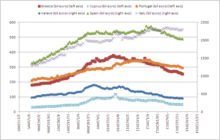
There is a very interesting correlation between bank deposits and the deposit interest rates that I haven't noticed yet. Whenever yields are low, be it that the government lowers interest rates or imposes taxes on deposits. The result is that people will flee out of bank deposits and move their money either into equities or gold. Or anything else for that matter. This is because investors are searching for yield on investment. If interest rates are low, they will find a better use for their money than putting it in a bank. Take Spain for example. Ever since the treasury yields peaked out in 2012, the same happened in the bank deposits in Spain. Spain 10 Year Yield As you can see here, the peak in Spain deposits (green chart) can also be found in 2012. Eurozone deposits

Spain's tax on deposits

Image
Today I read about the new tax on Spanish bank deposits . I wonder how fast the deposit outflows will accelerate in Spain's case, because the trend is not good. See the precipitous decline in Spanish deposits (green). I'm waiting for the May 2014 numbers to come out soon. I also think the negative rate from the ECB will have its effects soon. Actually, a tax on deposits is just the same as negative interest rates. It all comes to your money being routed to the government either through inflation or through taxes... Eurozone deposits

Gold Price Disconnected from Central Bank Balance Sheets

Image
With this correlation between central bank balance sheets Vs. gold in our minds, we can confidently say that gold will have to move to $2000/ounce in a hurry to balance out all the money printing in this world. Central Banks Vs. Gold Price To help you monitor the balance sheet expansion, you can check this chart daily. Look how Japan is almost winning the race from Europe.

Stock market overextended

Image
When GDP growth gets consistently revised downwards while the stock market goes up every day, we get an overextended TMC/GDP ratio at 121.3%. Yes, we are in a stock market bubble. The question is, when will it pop? Keep your finger on the sell button. First it was 0.1% GDP growth, then it was -0.1%, then it was -1% and suddenly today they reported -2.9% GDP growth. Incompetent people...

Avino Silver Tripling Its Production

Do you remember my call on Avino Silver ? Well, today Avino Silver made new highs, surging more than 60% in just two weeks. The near term catalyst is that it has everything set to triple its production in the second half of this year. I expect at least a cash flow of $40 million, which means the market cap of this company will at least double from here. While this is happening, the silver price is now even surging as shorts are covering their managed money short positions, which I talked about here . And more of those silver short positions are still to be covered... So basically we have 2 catalysts for Avino Silver. I predict that Avino Silver will shoot past $3/share in a few months.

Inflation expectation is rising

Image
The latest CPI numbers are out and we see that yoy inflation rates are now at 2%. I expect inflation to go higher in the future, because I see that the capacity utilization rate for May 2014 has been up to 79.1 for the total industry. For mining, the capacity utilization rate even goes to 91, the highest in decades. I guess the mining industry is working at near full capacity and that's good for commodities to go higher. Remember, when the CPI goes up and bond yields drop, gold goes higher. And that's exactly what is happening now. Bond yields are lower and CPI is higher.

Stock Screener: Take Three: Tai Cheung Holdings

Remember my post on KYN and my post on SIMO ? The stock has gone up 6% and the other stock has gone up 15% since we bought it and now it is time to move on. Track record 2-0. If I don't have any ideas anymore what to buy, I use the stock screener . What you want to do is filter on 4 attributes: market cap, P/E, dividend yield and percentage change. 1) Market Cap: do not choose small companies as they are mostly fraudulent or don't have sustainable earnings. Don't choose big companies because these are not volatile enough to get fast profits from. I'd filter between 200 million and 4 billion. 2) P/E ratio: choose the companies with the lowest P/E ratio, these companies are dirt cheap while still having earnings. Cheap is below P/E of 5. But do not choose below P/E of 2 because those are mostly companies that are going bankrupt or have bad growth. 3) Dividend yield: always choose companies that have dividends, because these companies have real earnings and can pro...

India Gold Demand Surges

Image
As predicted here and here , India shows signs of doubling its gold imports. I said India would at least add 30 tons a month and we got exactly 30 tons added in March. I think India is set to overtake China demand again. In Gold We Trust Koos Jansen

Smart Money Index: NASDAQ and gold version

Image
I can't get enough of this Smart Money Index, so I made one for the NASDAQ. As you can see, the NASDAQ bubble of 2000 is very visible here. The smart money was leaving the NASDAQ years before the bubble burst. Today, we also see that the smart money has already left the building (red chart going down). Let's do the same for gold. I  have the feeling that the Smart Money Index for gold isn't that useful to predict the gold price. But when looking at the chart I see that gold is pretty flat at this moment. I don't expect any large moves yet.

Smart Money Index (Correlation Economics)

Image
Here's my own fabricated Smart Money Index. Entirely free of charge. This Smart Money Index is a leading indicator for what the Dow Jones will do after a few months time. What I did is look at the average, opening and the closing prices of the Dow Jones historical numbers and compared them to the previous close. The Dow Jones historical prices can be found here: http://stooq.com/q/d/?s=^dji My Formula: SMI = previous closing price - (opening price- previous close) + (closing price - average price) Correlation Economics: SMI Index As you can see, the bubble in 2000 can be predicted with my formula. And the bottom of 2009 can also be predicted. In 2014, we see that the red curve is flattening out while the blue curve is still going straight upwards, which means we are in bubble territory now. So follow the Smart Money!

Smart Money Flow Index Vs. Dow Jones

Image
A very helpful index to predict what the Dow Jones is going to do is the Smart Money Flow Index . Just follow the smart money and the Dow Jones will correct itself to the smart money index.  The Smart Money Flow Index (SMFI) has long been one of the best kept secrets of Wall Street. Everybody knows the importance of a closing price and other last hour indicators like the Closing Tick, which we publish daily on our portal. The Smart Money Flow Index is therefore calculated according to a special formula by taking the action of the Dow in two time periods: the first 30 minutes and the last hour. The first 30 minutes represent emotional buying, driven by greed and fear of the crowd based on good and bad news. There is also a lot of buying on market orders and short covering at the opening. Smart money waits until the end and they very often test the market before by shorting heavily just to see how the market reacts. Then they move in the big way. These heavy hitters also have the bes...

From palladium to platinum

Image
As predicted , palladium has broken out now. I wouldn't jump on this mania, but instead look at another opportunity. Because similar to palladium, now platinum is setting up for an ascending triangle pattern. Because remember, the target of this rally is given below. Never buy higher than the height of the wedge.:

Mike Maloney: Death of the Dollar

Image
Mike has a little update on his presentation on the death of the dollar. (1 June 2014: Vancouver)

Managed Money Short Positioning Gold/Silver

Image
This page is created to monitor the managed money short positions in gold and silver on a weekly basis. Whenever the managed money short positions are high, this will mark a bottom in gold and silver price. If a subsequent short covering happens, the price of gold and silver will spike upwards. Each week a COT report is available here : http://www.cftc.gov/dea/futures/other_lf.htm

Managed Money Short Positions Gold/Silver

Image
To follow up on this post , I have started to monitor the managed money short positions every week for gold and silver because it's very interesting to see what is happening. As gold and silver were smashed down last week because technical resistance was broken, we see that the short positions have increased this week (red lines go up). For silver, the short positions are now so high, it doesn't even fit on the graph of the Got Gold Report. For gold the short positions are at the peak again. If gold ever shoots up (due to the ECB money printing), the short covering in gold will be strong, but the short covering in silver would be unimaginable. Here are the historic values from Got Gold Report : Numbers can be found here: http://www.cftc.gov/dea/futures/other_lf.htm